World Economic Forum – Garbage In, Garbage Out

Ah, the World Economic Forum. If ever an organisation epitomized the fallacy of measuring what’s easy rather than what’s important, it is this esteemed body of blinkered economists.

Joy of joys, they’ve just published the results of their annual Global Competitiveness Report. Which these days includes a specific ‘most innovative country’ section. Not that it has anything useful to tell anyone, but here is the ‘top 10’ according to the survey:
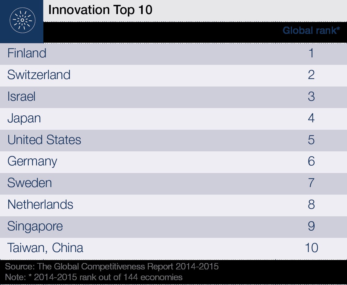
wef 1

The reason the result is essentially meaningless is largely because the WEF apparently has no idea what ‘innovation’ means. According to the way the study has been conducted, it apparently has something to do with:

  1. The amount of money being spent on R&D by companies
  2. Quality of academic research institutions based on the number of citations of academic journal articles
  3. ‘capacity for innovation’ on a 1-7 Likert scale.

The first criterion conveniently forgets the fact that 98% of innovation attempts fail. Innovation, in other words, has almost no correlation at all with the amount of money companies throw at it. In many ways, what the WEF have unwittingly collated is a measure of innovation inefficiency.

If you thought a 98% innovation attempt failure rate was bad, things get twice as bad when we shift the focus to the academic sector. In the EU right now, on average every million Euros invested in academic research is going to deliver slightly less than 10,000 Euros back in useful return. So measuring innovativeness based on university-anything is akin to counting sheep two years after you opened all the gates.

Or maybe, to extend the metaphor a step further and look at the third WEF calculation criterion, it’s a bit like asking a random passer-by to rank your field on its sheep-iness. On a 1-7 scale. Ah yes, that pasture looks like a five. Whereas that Albanian one over there looks like a four. Not only is the analysis meaningless, there is no-one on the planet that can make any of the cross-nation comparisons in any kind of sensible fashion. So much for that idea.

Above and beyond these three ill-fitting criteria, the WEF study also builds an analysis of patents into their findings. With a mere 97% of patents never making any money for their assignees, I guess you could say that this is one of the better measures. Having a patent granted is at least some kind of indication that you have an intention to monetize a new idea. The big problem, of course, given that inconvenient 97% number, is that measuring quantity of patents can only ever be a tiny part of the story. Admittedly it’s an easy thing to measure, but, per the introduction to this diatribe, just because something is easy to do shouldn’t justify doing it. Far better in this kind of situation would have been to try and measure innovativeness using something like patent quality.

That’s what we set out to do when we built the ApolloSigma measurement method: number of patents is almost pointless, how well they’re able to be monetized and how ‘future-proof’ they are is the thing you need to be able to quantify.

When we look at the global innovativeness story through the ApolloSigma lens, looking at the ‘Star’ patents granted during the year 2014, plotted against the number of patents generated in a country per head of population, here’s what we end up with:
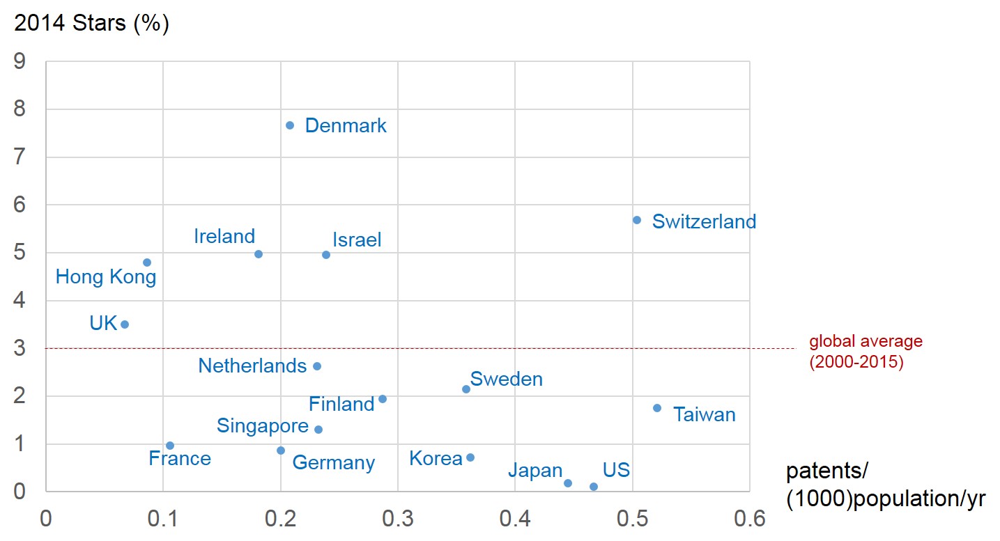
wef 2

First thing to say looking at this picture, I guess, is ‘sorry Finland, you’re not the most innovative nation on the planet’. Depending on how we interpret the graph, you’re barely in the top 10. Whereas, neighbour Denmark is. And moreover, if we just look at the quality of patents, Denmark was, by some margin the most effective patenter on the planet last year.

Okay. So much for patents. We’re still – in most parts of the world at least – falling in to the trap of assuming that ‘innovation’ is all about science and technology. These days the definition needs to include all of the business-model step-change stories. Maybe that’s where we should look next. See what a Top Ten list looks like through that lens….

What Happens When Everything Gets 4 Stars (****)?

4 star mags


I started to become conscious of the phenomenon a few months ago. Now I see it everywhere. I look at a movie poster and it’s full of 4 star reviewer ratings. I pick up my music magazine and every new album seems to get 4 stars. Everything, it seems, gets 4 stars.

So I got the SI research team to dig a bit deeper. Regarding my music magazines, it turns out I was wrong. Only two-thirds of albums get 4 stars. Nearly all of the rest get 3. The net effect, however, is precisely the same: the reviews tell me absolutely nothing about what I should consider spending my disposable income on this month. Same with the film I might go and see. Or the hotel I choose to stay in. When everything is about the same ‘pretty good’ standard as everything else, reviews have become meaningless.

Maybe that’s the point?

But then again, what if it isn’t? Humans are natural ‘satisficers’. When faced with a problem – like what music to buy – we more often than not allow ourselves to fall on a solution that does the job we want satisfactorily. But we’re also incorrigible changers. We love change. We especially love change when we get bored with the status quo.

And when the status quo is 4-star everything, we all become bored.

Now one possible response to this boredom is that I go on ebay and click any old ‘buy it now’ button and see what happens. Like a game of Russian Roulette. Only one in which every chamber in the gun contains the same 4 star bullet.

Which then lead me to think perhaps we need to dig a bit deeper and see why society is on this 4 star trajectory. Strictly speaking, I should probably say ‘Western society’, although in my experience, most other parts of the globe seem to be on the same basic path.

A Perception Map seemed to be a good next step. So we set about compiling a list of reasons why the migration to 4 stars is happening. Here’s what we found:

Everything gets 4 stars because:

  1. Everything is (perceived to be) getting better
  2. Producers increasingly all learn a success formula
  3. More mediocre (1, 2 and 3 star) solutions quickly get eliminated from the market, or never make it to market in the first place
  4. Critics are increasingly expected to ‘play nice’ (and in today’s social media world, we’re all critics)
  5. There are too many critics, and so its always possible for producers to find a critical mass of reviewers prepared to say 4 star things
  6. Rate of content production decreases and so an incredible amount of content gets created, so there’s lots of noise and consequently the 5 star cream never gets a chance to rise
  7. Audiences that have never experienced (or can’t remember) great content, don’t know what it looks, sounds or feels like
  8. Negative criticism is viewed as socially unacceptable
  9. More and more new content suffers from ‘Emperor’s New Clothes’ Syndrome

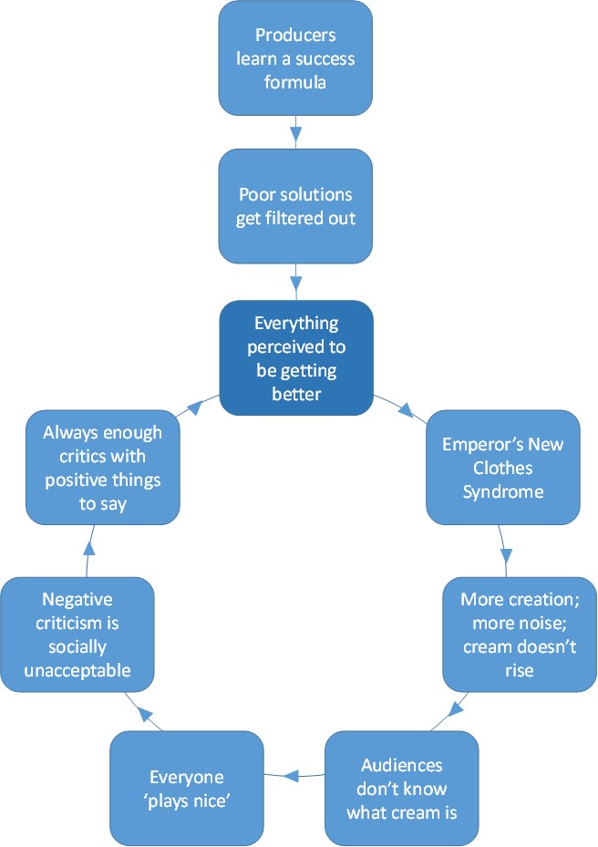
And here’s what happens when we link those comments using the ‘leads to’ question:

4 star map

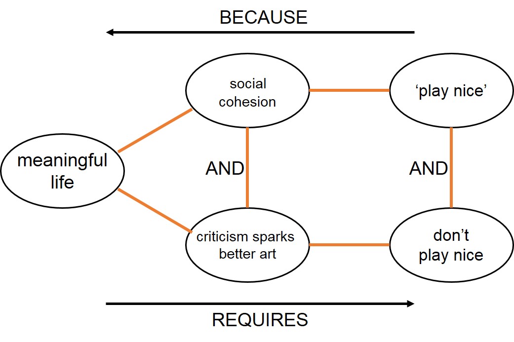
At first sight this picture doesn’t seem to look so bad. Everything seems to lead to things getting better. But scrape beneath the surface by walking yourself around the loop and what becomes clear is that this apparent virtuous cycle is actually a slow but invidious death spiral. Everything is perceived to be getting better, but actually isn’t because nobody dares say anything negative. Least of all that we might all increasingly be finding ourselves surrounded by 4 star naked Emperors. If we’re going to escape, someone needs to solve this contradiction:

4 star conflict The trick to finding 5 star talent, to creating 5 star music seems to come down to our ability to create a community of critics that can say things that spark artists to do better while at the same time being perceived as playing nice.

Or maybe forget the nice part? Maybe the best way to be nice is to tell people the uncomfortable truth?

Sounds like a job for Tough Generation X Nomads. Ready or not, come 2022, that’s what society will get. (Evil grin.)

In the meantime, we need to learn more subtle ways of playing nice and not playing nice. But, hey. Wait a minute. Maybe that’s exactly what a 4 star review has become? Maybe the critics of the world are indeed sending artists everywhere a covert message: a 4 star review is the new mediocre. Maybe its real message is ‘if you’re really an artist, you’re not supposed to settle for using the 4 star formula.’


In Defence Of The Contradiction Matrix

matrix


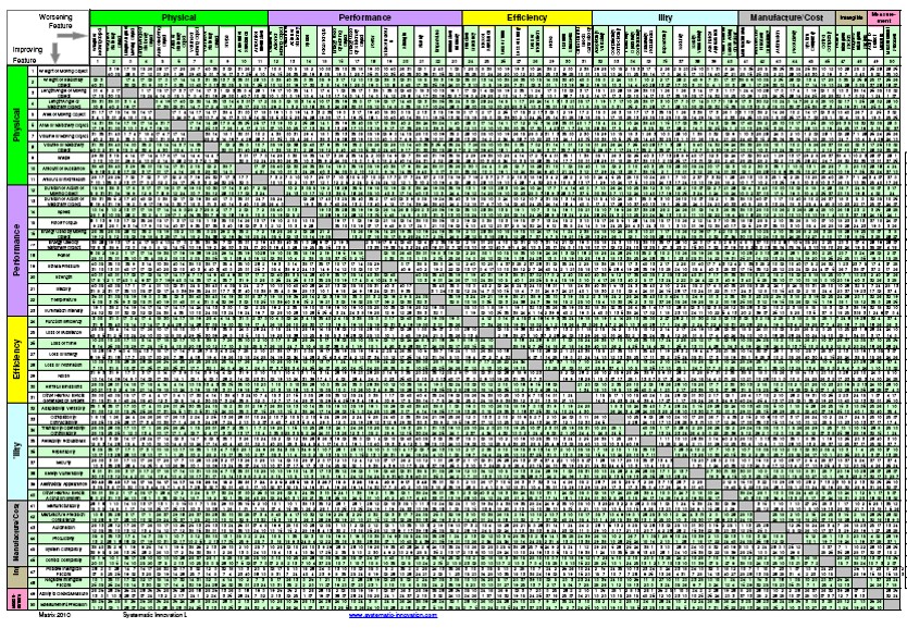
Ever since the early 1970s when Genrich Altshuller declared there should be no more work on the tool, the Contradiction Matrix has polarized the TRIZ community. In the East, and particularly with TRIZniks from the original former Soviet countries, the heart of the polarization can be seen with the frequent attempts to rubbish any attempt to update the tool.

‘Don’t touch TRIZ’ has long been a battle cry of the TRIZ traditionalists. But then at the same time, if we look at the curriculum of any TRIZ education programme it inevitably contains a significant portion devoted to the original Altshuller Matrix. So what we end up with are great numbers of people being taught how to use a tool that everyone in the TRIZ world knows is outdated and more often than not points users towards solutions that are either irrelevant or, worse, entirely inappropriate. Or, put another way, if you use a 1970s tool, you shouldn’t be too surprised to get a 1970s answer.

In the West, the polarization usually takes a different form. If there are only 40 Inventive Principles, the argument goes, why bother with the tedious task of looking up numbers in the Matrix? On one hand there is a lot to be said for this approach: for a team working on a real problem, one might rightfully say, it would be foolish for them not to examine all of the Principles to see how they might contribute to the eventual solution. On the other hand, there is a growing demand for efficiency in the innovation process. And, whichever way we look at it, randomly brainstorming through 40 Inventive Principles is not efficient.

It’s inefficient on two counts; firstly it means we spend less time thinking about what the contradiction we want to solve really is. This means we’re less likely to find ourselves working on the ‘right’ problem. And spending time working on the wrong problem is about as inefficient as it is possible to get.

Secondly, when we do use the Matrix its main job is to provide us with a ranked list of Principles that we can systematically apply to our problem. The key word here being ‘ranked’. The current version of the Matrix we’ve built to tackle technical problems now benefits from over five million case-study data points. This means that when the Matrix tells us that an Inventive Principle is the most frequently used Principle to solve our chosen problem, it means that literally tens of thousands of people have used precisely that Principle to solve the problem. Not to mention the four billion years of biological evolution that our research has also reverse-engineered and added to the tool.

The Systematic Innovation research team continues to devote significant time and energy to updating the Matrix. In a typical month, thanks to the advent of smart contradiction-finding software tools, we’re able to analyse several thousand new patents and academic journal papers, find the contradictions, reverse engineer how they have been solved and add the findings to the Matrix. We do that because we spend most of our time working for clients that are serious about innovation, clients that know it’s more important to find the right problem and deliver the best solution than it is to tell the world about how they did it. The current and all of our future Matrix tools are developed with these serious users in mind.

Efficiency looks set to be the dominant innovation driver in the next ten years. And yet, somehow, TRIZ usage is currently on the decline in many parts of the world. Herein lies another intriguing paradox: how can it be that the methodology that has the most to contribute to efficient problem definition and solving is being used less and less?

Whether TRIZ will survive into the future probably has much to do with the aforementioned polarisations and paradoxes and how well they get solved. If, indeed, they do ever get solved. Another odd aspect of the TRIZ community is that it often seems reluctant to apply its own tools to the problems it encounters. One thing is clear, however, and that is if the TRIZ community is to turn around the current decline, it needs to grow the community of invisible serious users and help them increase the rate of tangible, visible, success stories. Hopefully using tools – like the latest Contradiction Matrix – designed to deliver useful outcomes.


Proactive Ambivalence?

“Often, if there’s something that I want to do, but somehow can’t get myself to do, it’s because I don’t have clarity. This lack of clarity often arises from a feeling of ambivalence – I want to do something, but I don’t want to do it; or I want one thing, but I also want something else that conflicts with it.”

Gretchen Rubin


‘I don’t know’, ‘I don’t mind’, ‘I’m easy either way’, ‘I’m happy to go with the flow’.

All statements that come out of our mouths accompanied by a faint sense of guilt. Somehow society has conditioned us to have clear and definitive opinions about stuff. Not holding such clarity often means we’re accused of being a ‘fence-sitter’, ‘indecisive’ or ‘dithering’. As if they’re necessarily bad things.

Which, of course, they sometimes are. That’s because there are two very different ways by which we can be ambivalent about a situation. Both can be seen vividly in our ‘new’ kitchen. Where, somehow, we managed to spend just over a year not making a decision about what tiles to put up.

I’m the lead ‘negative ambivalence’ part of the kitchen tile story. I can’t make my mind up because I’m too apathetic to stir my brain into action to contemplate any of the alternatives on offer. The landslide of samples that have been and gone over the last twelve months have been a mere rainbow-coloured blur in my mind, because frankly I don’t care what colour(s) the tiles end up being. Pale-burgundy is much the same as duck-egg-blue in my head, tile-wise.

The positive side of the ambivalence story is that the pale-burgundy-duck-egg-blue debate has, until very recently, still been ongoing because there’s a dilemma that needs solving. In this positive side of the story, the ambivalence has been useful incubation time for playing out the consequences of the two-sides of the dilemma, and filling in the  knowledge gaps. And, moreover, done in such a manner that I’m now confident that we have ended up with a solution in which the dilemma has well and truly been transcended. It is the ‘right’ solution.

Proactive ambivalence is about recognizing the presence of a conflict – there are advantages on both sides of the fence – and proactively working out how the conflict can be resolved without making a trade-off.

Take me outside the kitchen and thinking about music, and I’m much more inclined towards this kind of proactive ambivalence. Example. Paul Simon and Sting are touring the UK together at the moment. Should I go and see them? I’m not sure:

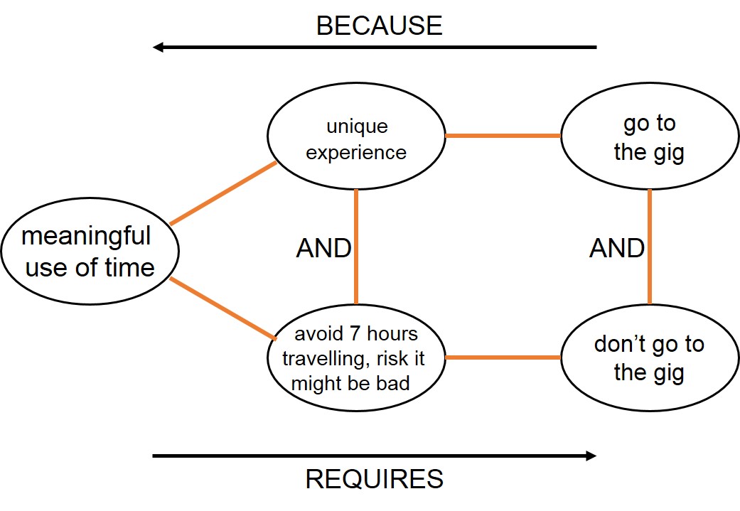
I think Paul Simon is one of the greatest songwriters that’s ever lived, but, I don’t think he’s a great live act. Conversely, I think of Sting as a pompous, moralistic egotist, but (damn him) that he also possesses a genius-level kind of leadership and feel when it comes to getting the most out of musicians on stage. So does the combination of the two of them equate to the best of either worlds, or the worst? Either way, though, in all likelihood, they’ll never tour together again, so whatever happens it will be ‘unique’. Couple all that with the more practical issue of the (near-stratospheric) price of the tickets and the fact that I’ll spend seven hours in the car getting to and from the gig, and there’s an awful lot to be proactively ambivalent about:

ambivalence

I’m fortunate here to have a whole toolset designed to help transcend these kinds of conflict and contradiction, but even with all of them at my disposal, the solution process can still take time. In the large majority of cases, the non-emergence of a solution is indicative of the fact that there is still some important missing information. Part of the proactive ambivalence, in this situation becomes working out what’s missing and then finding it. How could I find out whether the Simon/Sting combination is good or bad? Check out the reviews.How could I avoid having to spend seven hours in the car? Find a client or clients in the same city the morning after the gig? How could I avoid having to take out a second mortgage to fund the ticket? Look for cut-price auctions on the ticket resale websites.

Proactive ambivalence. The Boy In The Bubble, seeks Message In A Bottle, finds bottle, transcends bubble, agrees the duck-egg-blue kitchen tiles look great. All is well with the world.

Haystacks Without Needles?

I was speaking at a CIO conference last week, feeling a bit nervous that I was about to suggest that their collective Big Data efforts were delivering zero value. I needn’t have worried. They already knew.

Considering the Big Data industry invoiced $20B last year, that’s quite an admission of failure. Almost enough, one might guess, to merit some kind of investigation. On that point, however, I suddenly felt very much alone again. Everyone I spoke to seemed to reluctant to dig deeper.

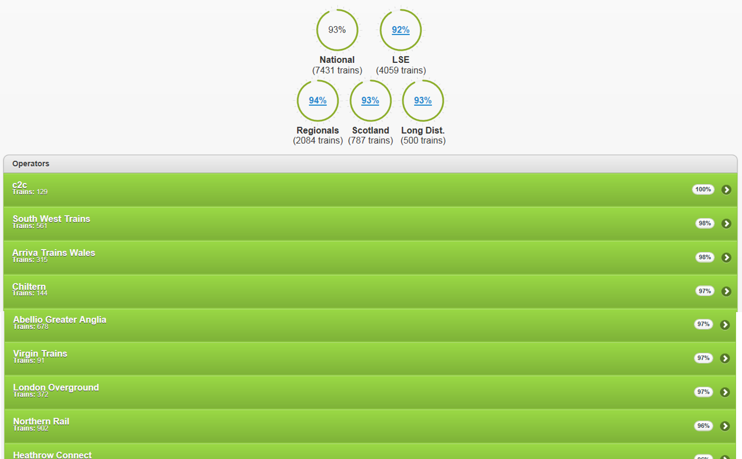
Take a current UK example.  liveppm.com is a website that allows the British public to see a moment-by-moment update on the punctuality of trains on each of the country’s networks. From a purely technical standpoint – every time a train departs and arrives at a station anywhere in the country it’s performance is instantly updated on the site – its inconceivably impressive. From a ‘does it do anything useful?’ perspective, on the other hand, it can only be seen as a pointless waste of taxpayers money.

haystacks

Now I’m not totally blaming the IT professionals that built the system: they were given a brief and they executed it in spades. A bigger portion of the blame, one suspects, has to head in the direction of the Rail Regulators – the people tasked with making sure the taxpayer’s money is being wisely spent. On one level, checking how punctual our trains are serves might serve some kind of useful purpose. At first blush, I have no argument with the collection of punctuality data. It’s difficult to know if you’ve improved a system if you can’t measure what’s happening. It’s only when the information is used to set targets that the problems start. Setting arbitrary targets in order to impose penalties and generally beat people up destroys value and becomes an impediment to improvement. That’s because all the targets ultimately serve to do is encourage operators to improve the way they cheat reality in order to make the figures reflect better on them.

Meanwhile, the poor old commuter is paying for the whole downward spiral sham. Both directly in terms of the millions it cost to set up and maintain the system, but – far worse – indirectly in that it provides them with absolutely nothing that allows them to make any meaningful travel decision. The system is an expensive needle-less haystack. Learning that the 92% punctuality record of an operator today only means something if I have the choice to use another, higher performing, operator. And even then I have no idea whether the performance of my operator will be any better or worse tomorrow. Not that the majority of us have any choice either way. If I live in rural Devon, I can’t elect to catch a London Overground train. Tangibly, the punctuality data is useless to the commuter. Intangibly it is far, far worse because it adds frustration and annoys anyone that cares to look at the data because it leaves us with a feeling of utter powerlessness. That (twist the knife why don’t you) we’re paying for.

In all these respects, it’s a highly typical Big Data ‘solution’. The Data is only ever of any use if it reveals actionable insight about a situation. Insight is the needle in the haystack. Insight in the case of train punctuality is enabling the commuter to make decisions about whether they should bother to leave the house today. Or to take the car or bus instead. Or stay in bed five minutes longer because the specific train they intend to travel on is running late. Or, lest the train operators might also wish to do something vaguely useful with the information, allow them to put in place actions to improve performance of the network. Those are needles. Needles are difficult to find because they require seekers to go beyond what is merely easy to measure. Measure the wrong things (train punctuality), for the wrong reasons (to punish operators with a poor punctuality record) and while you might end up with a multi-million pound size haystack, it sadly contains no needles at all.


What Matters To You?

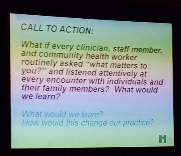
At a healthcare conference today, someone deemed it a good idea to put this slide up on the screen:

matters1What I like about it is, someone is at least thinking about asking for a patient’s opinion.
What I really don’t like about it is the naivety of the question. First up, ‘what matters to you?’ is precisely the sort of question that guarantees a meaningless answer. It’s supposed to try and tap into people’s emotions, but, as the FMCG industry has known for the last decade, ends up doing the exact opposite. It’s precisely the sort of question that has people lift their eyes to the ceiling trying to work out how to fob you off with the quickest answer that will get rid of you. A lot like what we all do when a waiter comes up to us in a restaurant and asks us whether we’re enjoying our meal. Few if any of us tell the truth.

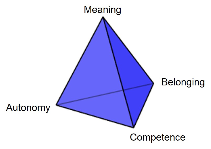
Second, and much more important, the main reason there’s no point in asking the question is that we already know the answer. When we try and tap into what drives people’s behaviour we know that there are essentially just four drivers:

matters2And, frankly speaking, the healthcare system universally makes all four of them worse:

Autonomy: the moment a patient steps inside a hospital they just handed over control to someone else

Belonging: the fact that the patient is ill means they no longer feel part of ‘the tribe’

Competence: the healthcare system has unwittingly created a population of learned-helpless people that have no idea what is going on when it comes to the working of the healthcare system

Meaning: an awful lot of the form-filling and other bureaucracy activity the patient sees is utterly meaningless to them.

When people like Steve Jobs stood up and said, ‘I don’t need to go ask the customer what they want’, it wasn’t arrogance it was an innate understanding of these four drivers and the need for Apple’s products and services to make all four of them ‘get better’. It’s exactly the same in healthcare: what matters to patients is giving them more Autonomy, a greater sense of Belonging, a feeling that they are Competent, and that anything that happens will be Meaningful. It’s not rocket science.

The Folly Of Idea Management Systems

The most delusional industry on the planet is the one populated by so-called ‘creativity consultants’. They seem to be under the collective mis-apprehension that their clients are short of ideas. The second most delusional industry on the planet is the one responsible for creating and selling ‘idea management solutions’. Usually to the same clients that thought they were short of ideas.

In theory, it makes for a cunning one-two: one, ‘we seem to be lacking ideas’; two, ‘best bring in an idea management system to cope with all the ideas we receive once we have inspired everyone to start generating lots of them. In practice, it’s a bit like a tattoo studio selling clients a tattoo-removal saw in case they have a future change of heart.

saw


For the last decade, ever since I’ve been asking the custodians of these idea management solutions the question, not a single one has been able to convince me that their system has added even the smallest iota of tangible or intangible value to either the business or the poor souls who typed the details of their precious, fragile idea into the stupid system. To use another uncomfortable metaphor, we might just as well have cut a slot onto a toilet seat lid and labelled it ‘suggestions’. We might have had to unblock the outlet pipes once in a while, but otherwise, everyone would save a heck of a lot of idea management system adminstrators. And their supervisors. And the army of idea management software vendors that seem to be so desperate these days I need a machete to cut through all my idea management system spam mail.

The heart of the issue is this. The last thing a good idea needs is ‘managing’. Granted, any idea when it first appears is fragile. But if it’s any good, no-one that hears it is ever going to forget it. What it needs is nurture. And leadership. What it doesn’t need is to be pigeon-holed in some software geek’s idea of an idea factory farm.

Only bad ideas need to be managed. And frankly, the best way of managing them would be to cut actual, non-metaphorical slots in all the toilet seat lids in the company. Huh? Have I just taken myself full circle. I got it wrong the whole time. The real purpose of idea management systems is to formally dispose of and kill the myriad bad ideas that would otherwise have distracted everyone from the serious business of nurturing the tiny minority of good ones. I apologise.

Low-Hanging Breakthroughs?

A lot of organisations talk about the size of their innovation attempts in terms of hops, steps and jumps. The accompanying logic is that the ‘low-hanging-fruit’ hops are ‘easy’ and the ‘breakthrough’ jumps are difficult. To a large extent that perception is correct. But it’s also a contradiction, and therefore an innovation opportunity in its own right. Solving the contradiction would mean something of a business holy grail: ‘easy breakthrough’.

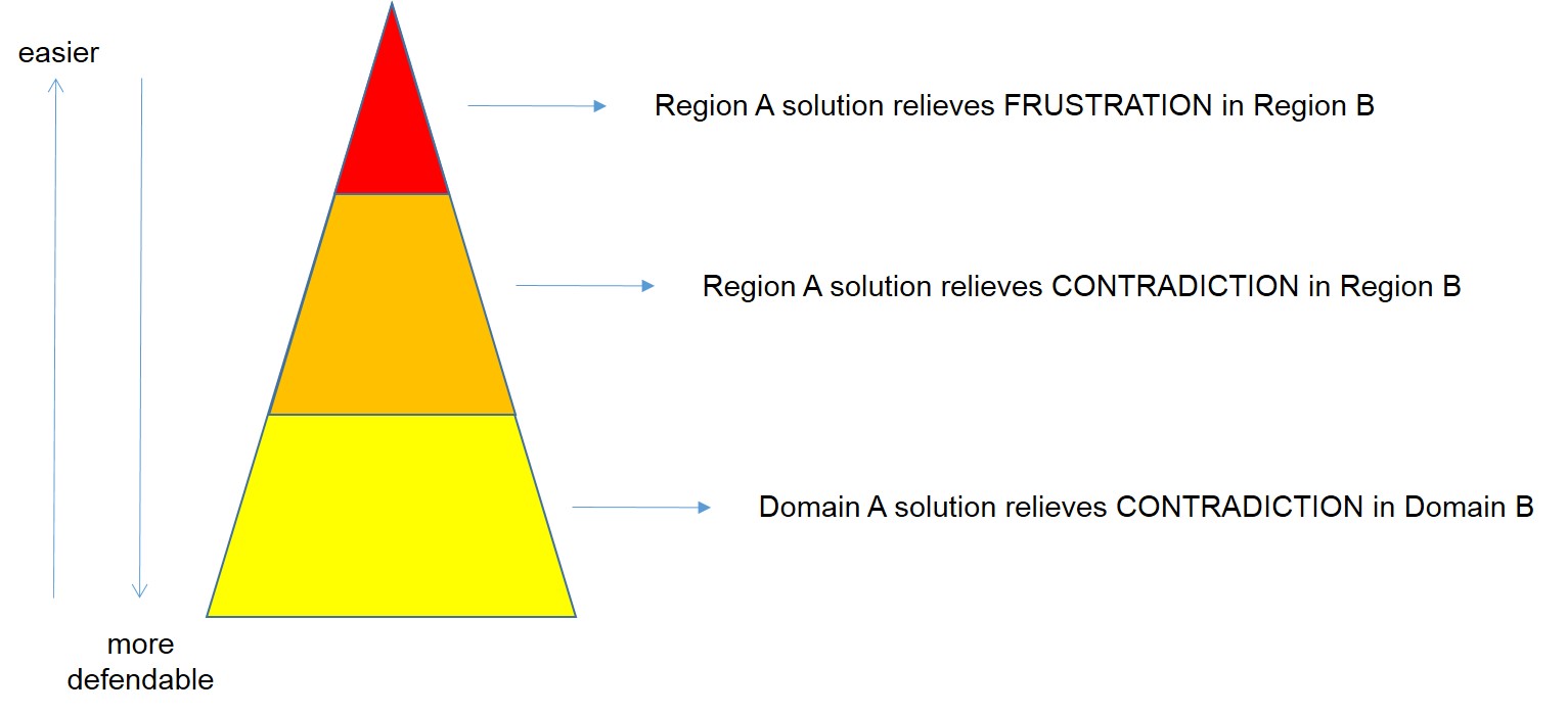
The main precept of Systematic Innovation is ‘someone, somewhere already solved your problem’. Which means there must be examples of these kinds of low-hanging fruit jump innovations out there. And sure enough there are plenty to be seen. Spend enough time analyzing them all and a pretty clear theme begins to emerge: so far there are three ways to create a ‘low-hanging breakthrough’:

low hanging breakthrough

The easiest of the three is all about a geographic transposition: A proven solution from Region A is introduced into Region B and is successful because it removes or reduces an underlying customer frustration present in that region. Typically all that is required to make these kinds of translation into a success is a big enough marketing or messaging twist to overcome any issues of IP (principally copyright) infringement.

The middle of the three is another variant on the geographic transposition. This time, a proven solution from Region A is introduced into Region B and is successful because it resolves a contradiction experienced by customers in that region. Solving the contradiction typically involves another twist relative to the original solution, but this time the product or service itself (as opposed to just the messaging) is very likely to change. The phenomenal success of probiotic yogurt drinks like Actimel in the West in recent times represents a great example of a simple pair of contradiction-solving product design twists on the original solution, the Turkish drink, kefir. The twists in question being: make it taste nice and make it ultra-convenient.

The third low-hanging-breakthrough category we can see lots of examples of is about a transfer of proven solutions from one domain to another. A solution in Domain A is used to solve a frustration or, more usually, contradiction in Domain B.

As with all things in life, whenever we solve one contradiction – easy breakthrough in this case – the next one quickly reveals itself. In this case it probably has something to do with the likely longevity and protectability of the new solution. If all you’ve done is given a new name twist to a product you discovered on the other side of the planet, then by all accounts it will be easy for anyone else to do the same thing. But then, hey, that’s merely a contradiction too, right? And someone, somewhere will already have solved that one for you too. The main trick, as ever, is staying one contradiction ahead of everyone else. The less obvious, but probably more important precursor is developing the capability to map and track the contradictions and frustrations of potential customers in other Regions and Domains to yours.

Measuring Real (Innovation) ROI

It feels like there are a million and one ways to define ‘inovation’, but the one we here in Systematic-Innovation-Land typically end up using is ‘successful step-change’. Simple enough, but still plenty to cause a deal of confusion when we try and apply it in a specific organisation. The main problem usually comes with the word ‘successful’. Probably because the word puts the onus back on the project team to define what success means to them. The generic idea at that point tends to distill down to some form of net value addition, but specifically, I would say that in nearly every case – certainly in the commercial world – we find ourselves deferring to the accountants in the room and their desire to see a positive Return On Investment: the ratio of the net receipts back from customers over how much money was spent to get there. Simple again. Except, it misses at least half of the story. ‘The most important numbers are unknown and unknowable,’ so said W Edwards Deming in his gruff attempt to get the accountants to wake up and recognize the presence of all of the emotional and intangible issues that inherently weave their way in to any innovation story.

Any meaningful measure of innovation success, I believe, needs to take due account of these intangible issues. I also believe that the late great Dr Deming was largely wrong when he declared they weren’t measurable. They’re merely more difficult to measure than stuff like dollars and cents.

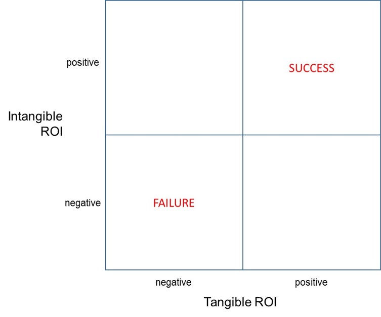
The simple act of allowing ourselves permission to contemplate the possibility that in the innovatiinnovationroi1on intangibles can be calculated should permit us to draw grids like this:

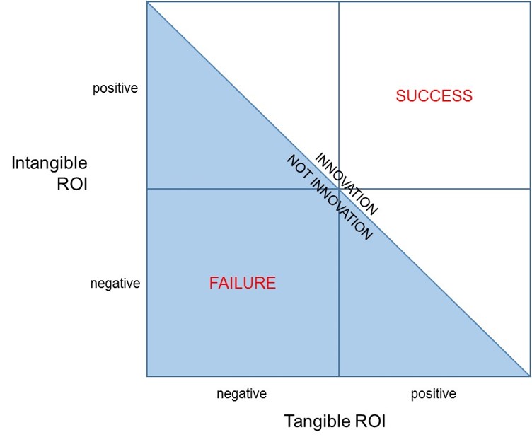
Assuming it then becomes possible to somehow cross-calibrate and connect tangible and intangible ROI (a fairly big assumption, granted, at this point), it becomes possible to get a more complete definition of what innovation is: the boundary between innovation and not innovation corresponding to a diagonal line drawn from the top left to the bottom right of the grid:

innovationroi2

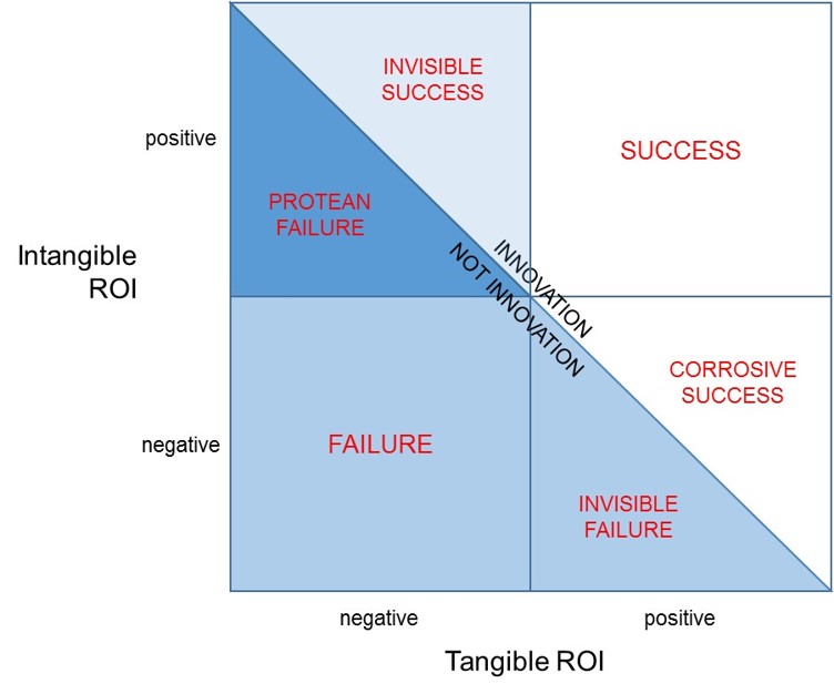
Everything above this line we can see is an innovation because the combination of tangible and intangible ROI is net positive, and everything below is not because the combination is negative. The diagonal line also allows us to think about and define four triangular areas. Here’s our current attempt to do that job:

innovationroi3

Which nows gives us six possible innovation ROI scenarios:

Success (where we’d really like to be) – ROI from both tangible and intangible sources are both positive, and hence the success of the attempt is unequivocal.

Failure (where we really don’t want to be) – ROI from both tangibleand intangible sources are both negative: we didn’t win on either count.

Invisible Success – as in ‘invisible to the accountants’ – the project did not make a positive return against their tangible ROI metrics, but the intangible ROI actually turned out to more than offset the negative tangible figures. This is the innovation project we thought had failed, but once we took due account of all of the issues, we should actually have called it a success.

Invisible Failure – represents the converse of invisible success: this is a project the accountants and tangible figures told us had been successful, but sadly, after taking into account the negative ROI for the intanigbles, we should actually have described the project as a failure because our customers were emotionally worse off than before we turned up with our bright idea.

Corrosive Success – a situation where the tangible figures tell us we’ve been successful, but the ROI from the intangibles was unfortunately a negative number. Not so negative as to completely wipe out the tangible gains, but a corrosive problem because we got the intangibles wrong and therefore most likely planted some unfortunate negative emotion seeds in the minds of customers. Seeds like loss of good-will, loss of trust, ‘you trapped me in your eco-system’, etc, that make it much more difficult for the next round of innovators in the organisation to succeed.

Protean Failure – another segment that has to be seen as a failure, because overall ROI when we totaled up the tangibles and intangibles was negative, but we shouldn’t be totally de-moralised because we did actually get some of the intangibles right. And given that, right now, we all know far less about the intangibles than we do about the intangibles, in many ways we got some aspects of the most difficult part of the innovation story right. Which in turn is trying to get us to consider that a simple re-think in the way we presented our solution to the customer we might be able to get the project across the line and into the ‘innovation’ half of the picture. We use the term ‘Protean’ here in the sense that our best success strategy is to become fluid and adaptive (like the Greek God, Proteus) and experiment with different things until we find our winning ‘Plan B’.

So much for re-thinking how we define the ROI of an innovation project. It might be okay in theory to say that we can measure ROI in terms of the intangibles, the real test of the model can only come through a translation of that theory into practice. Which is where our PanSensic tools usually come to the rescue.

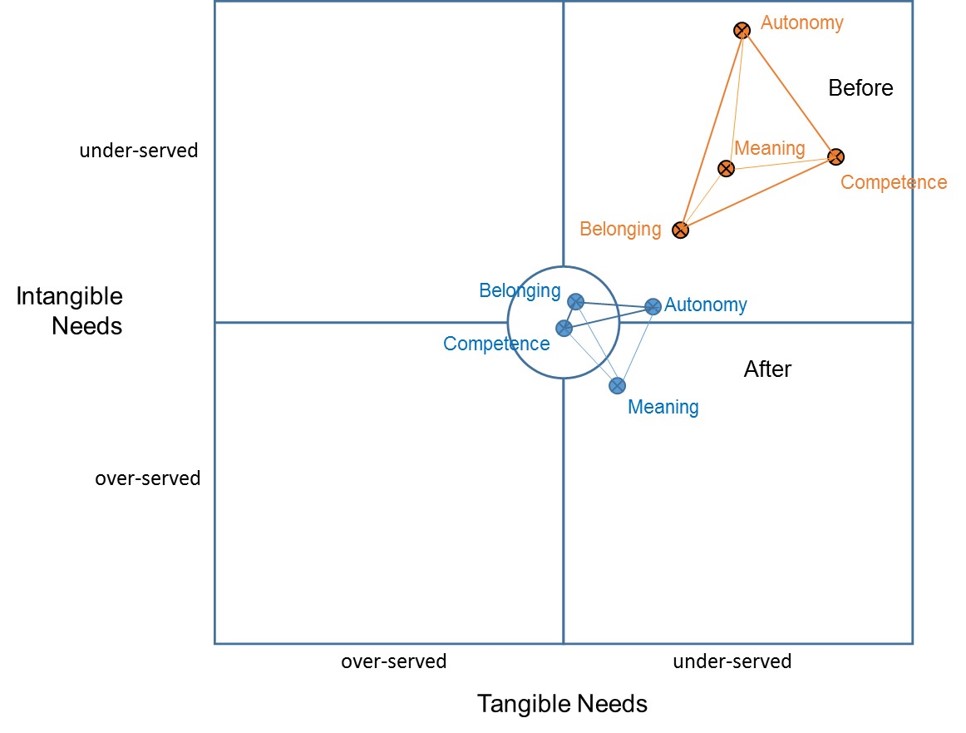
They have done so in this case as a result of a large piece of work to find ways of defining and plotting what we came to call the quartet of ‘human universal’ intangibles – Autonomy-Belonging-Competence-Meaning (ABC-M) – onto a map of frustrations:

innovationroi4

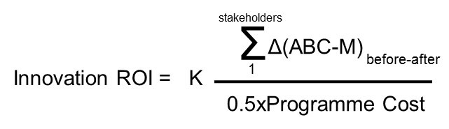
Although still not easy to calculate (see Systematic Innovation e-zine, Issue 146 describes how we do it), once we’ve found a way then we have a means to calculate the benefits part of the ‘Intangible ROI’ parameter in terms of the delta between the (ABC-M) scores for each stakeholder before and after the innovation attempt. So that we end up with something like:

innovationroi5

Where K is a constant that can be used to ensure the weight of the intangible ROI result is equitable with the (much more easy to measure) tangible ROI. Simple when you know how. Or, if not, keep your eyes peeled on the coming ezine issues, where we’re expecting to publish a case study or two. And maybe reveal a ‘was that really an innovation?’ surprise or three.

PanSensic Micro Case Study #2: Coldplay

Full disclosure. I’m not a Coldplay fan. I’m probably in a minority. Close to a thousand people have taken the time to give the band’s latest album, Ghost Stories, a Five Star review on Amazon.co.uk. Here’s one of them:

5.0 out of 5 stars Beautiful, haunting and soporific album. Excellent! 19 July 2014

This review is from: Ghost Stories (Audio CD)

For those expecting something along the lines of “Mylo Xyloto” or “Viva la Vida”, this will come as quite a (hopefully pleasant) surprise. Coldplay have taken a break from the previous, more energetic style to create this reflective, soporific, often quite melancholy yet extremely soulful album. Haunting melodies and gentle rhythms run throughout, and the style though slower and more relaxed is still distinctively Coldplay. As ever, it is skilfully written and put together, and the mixing and sound engineering is unsurpassed. It is definitely an Album in the old fashioned sense with all the songs taking the listener on a musical journey with a beginning, middle and conclusion, and they all naturally complement each other.

Whilst it may not appeal to all Coldplay fans, particularly those who like the earlier albums rather than the later ones, the band has shown once again their capacity to evolve and innovate as they progress through life, but retain their distinctive style. Interestingly, some of the song structures do remind me a lot of the recent Avicii “True” album (which is also a favourite of mine). I urge you to take time out, sit down in a comfortable chair and just simply listen to it right the way through to fully appreciate it.


Normal (Level 1 or Level 2 on our BDA Capability scale) analysis of this review would tell you this person likes this album.


PanSensics will tell you:

  1. This person has strong ‘pilgrim’-like opinions about things
  2. Those opinions are weakly held
  3. He is frustrated that people don’t seem to listen to him
  4. He hasn’t listened to any of the words in the songs
  5. He probably wouldn’t like them if he did
  6. He thinks the band is stagnant
  7. Is likely to describe the next album as a ‘return to form’ and declare this was the worst Coldplay album (unless, of course, the new one turns out to be even worse… in which case, he is likely to recommend people revert to the early ‘classic’ albums)

‘Maybe I’m just a ghost

Emptier than anybody knows

Maybe I’m on the ropes

Or I’m not even here..’

Hmm..