Mercedes surprised no one by regularly topping the timing screens in Formula 1 testing at the start of this year. They did, however, manage to spring a surprise when one of the enabling innovations was revealed: DAS or, to give it its full name, dual-axis steering.
On-board
footage showed both Lewis Hamilton and Valtteri Bottas pulling the wheel
towards them on the straights, before pushing it away when reaching the
corners. They could not hide it any longer, and technical boss James Allison
was seemingly happy to confirm its existence – if very little about what it was
actually doing.
The innovation,
it later transpired, was all about dynamically altering the toe-angle of the
front wheels of the car.
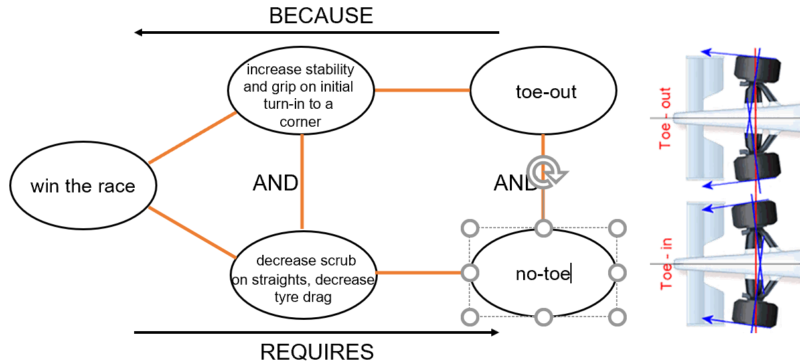
Why would
Mercedes want to do this? To briefly explain, toe is the angle that the wheels
sit in relation to dead ahead when the steering is straight. If the front of
the wheels are pointing out, this is known as toe out, the opposite and they
are toed in.
The toe angle
has a significant effect on a car’s handling and changes how the tyre interacts
with the road surface. Generally, a degree of toe out will aid both stability
and grip on initial turn-in to a corner, however, too much toe out means the
tyre scrubs – effectively it is dragged rather than rolled across the track
surface.
TRIZ-wise, here’s a classic physical contradiction: the car wants toe-out and it doesn’t want it. Something like this:
Once we know there’s a contradiction to be solved, all we need to do is think about the three different separation strategies and we’re half way to a solution. Actually, in this case, all we need to do is think about the first of these strategies, separate in space. Where do we want toe-out? Where do we not want it? As soon as we realise the two questions have a different answer – corners versus straights – we can start tapping in to the solution strategies of others. The most common of which is Principle 1, Segmentation.
Simple when you know how. As ever, the real trick is giving yourself permission to believe that contradictions don’t have to be solved by the usual trade-off strategies.
Another unexpected benefit of lockdown. I used to have to spend hundreds of pounds to travel to conferences to get angry about the parlous state of academia and what might laughingly be called the knowledge industry. Now I get to log in to a free webinar while sitting at home, looking at nature outside my office window. I find the anger dissipates faster when you get to watch a blue-tit feeding its four just-fledged offspring from the bird-feeder.
Sadly though, not fast enough to prevent me feeling the need to write another rant-y blog article.
This week’s primary anger maker was a Cisco-sponsored event for the launch of a new book on leadership. The author in question – I won’t name him (it is a he) as it feels like adding oxygen to an already alight dumpster-fire of a TED-speaking career. Not bad for someone that still looks and sounds like he lives at home with his parents.
The dumpster-fire in question is the effect this author and his three previous ‘best-sellers’ seems to be having on the world of business. Which, frankly, doesn’t need any more oxygen either these days, never mind more fuel. This, rather than the subject-matter-dunce penned book, becomes the point of the rant.
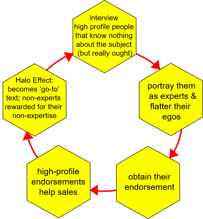
The premise of the anger-inducing new book was to think about leadership in the future. Fifteen years into the future to be precise. So far so good. It’s an interesting question. Provided, of course, that you follow it up with a sensible method for obtaining answers. Of which going to interview large numbers of CEOs is definitely not one.
CEOs get to be CEOs by having been operationally excellent yesterday. I’ve yet to meet a CEO anywhere that understands what innovation is. Or what the pulse rate of their industry is. Or where on a Complexity Landscape would they place their organisation. Or what antifragile means. Which basically means that asking this cohort about what the world will look like in fifteen years is about as valid as me asking the cat. Lennie has no idea, and neither do CEOs. On balance, I think if I had to pick one, I’d go with Lennie. At least he knows he doesn’t know.
So what, you say. Just ignore the stupid book that results from the interviews. What do I care? Much as I’d love to be able to do that, it turns out that it has already triggered a host of five-star reviews on Amazon. Thus putting into play a ‘virtuous cycle’ that I imagine the naïve author (or, more likely, his publisher) was rather less naïve about. Writing (lord save me) 300+ pages of grandchild teaching grandmothers to suck eggs cliché-ridden glibness turns out to be a most excellent way to flatter the egos of future-blind CEOs. It sets up a rather splendid bit of symbiotic sycophancy: By writing an endorsement of the book, the CEOs get to show their shareholders that they’re featured thought-leaders in a book about not just leadership, but leadership in the future. The author gets to show off all the names of high-profile CEOs that endorsed his work. The publisher then gets to sell a shit-load more books. And, before you know it, the book as become a classic. The ‘go to’ tome on leadership in 2035. No doubt to be picked up and used as a reference guide by just as naïve academics and, worse, people like Dominic Cummings and his growing army of not-so-superforecasters (not so good that is unless they’ve bet on the economic destruction of the UK economy (which I kind of think they have)). This is why we’re in the mess we’re in. And I don’t just mean the UK economy. The whole shebang is in tailspin.
I’m not sure whether we’re too late to stop it, but I do know that if we’re going to stop it before we find ourselves back in the Stone Age, then we have to stop the sort of ‘virtuous cycle’ created by this truly awful piece of leadership half-science. This is what it looks like:
It probably
needs a catchier name before it has a chance of being turned into another 300+
page management text, but for the moment, I’m going with the Sycophancy Cycle. That
or, Stop The Ride, We All Need To Get Off. I’m drawing up the interviewee list
as we speak.
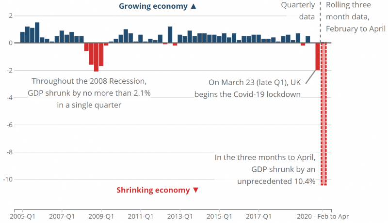
Difficult times call for radical measures. The UK economy is is Covid-19 sparked freefall. Something needs to be done. Easy stuff.
In no
particular order, here are ten highly effective, proven strategies for
increasing GDP:
Spark a crime wave
Sink fully-laden oil-tankers off the coast (other environmental disasters will also work)
Create the conditions for household disharmony in order to increase divorce rates
Encourage eating of fast-food every day (especially if it can be delivered)
Encourage rioting
Stop building or maintaining flood defenses
‘Break your neighbour’s arm’ (thanks, Umair Haque)
Encourage bad driving in order to increase traffic accidents
Construct more out-of-town shops and other things that increase inconvenience
Encourage more social media rage and hardening of echo chambers
GDP, of course, is merely a measure of total national expenditure (or income). It doesn’t discriminate between expenditure we might enjoy (eating better) and that which we’d prefer to avoid (having to buy big new padlocks).
Better yet, to be serious for a second, why not use this unique opportunity in global history to acknowledge that GDP is an utterly irrelevant measure of economic success. Well, irrelevant to everyone apart from the greedy bastard 1%.
There have been several attempts to produce more sensible measures of a nation’s success. They all seem to get bogged down in the vested interests of the already rich. The 1% don’t want ‘Genuine Progress Indicators’ or ‘National Happiness’ indexes. They want more money in their bank account in the easiest, lowest effort manner possible.
Now is the time to find win-win solutions. I don’t mind the 1% making more money, I just don’t think they should be allowed to do it by making life worse for everyone else any more. All we need to do is introduce a system where all the things like this Top Ten get counted as the negatives they are.
Have you ever
found yourself brushing your teeth, looking at the tap you’ve left running while
you brush? You know it’s wasting water, but you do it anyway.
Too long ago now I had the pleasure of working with one of the FMCG giants to try and understand why people sometimes did this. I sometimes wish the research had been published, because I thought it would help explain a lot more about society than how to sell more toothpaste.
I was reminded of the research again this week while looking at photographs of the 41 tonnes of litter collected off Bournemouth beach following the warmest day of the year so far.
Why would people suddenly not be taking their litter home? Looking at photos showing the high density of the non-social-distancing crowds from the day in question, my first thought was that it was because the situation was like Glastonbury festival, where, for the most part the crowds are too dense to even contemplate a walk to a bin. But, no. The crowds were dense (in more ways than one), but not dense enough to prevent movement.
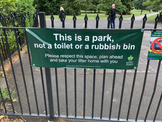
More evidence
that the answer had nothing to do with a very tangible ‘can’t move’ explanation
came in the form of an even more depressing photo of the signs that the keepers
at St James Park in London have felt the need to put up, also this week:
Never, the keepers
have been declaring, have so many people left so much litter in the park
before.
Again, the park
had been busy, but not that busy.
Enter the running-tap explanation. The people that knowingly leave the tap running while they brush their teeth turned out to be people experiencing an absence of autonomy in their lives. Leaving the tap running, even though they knew it was wrong, was a way of demonstrating control. Breaking the rules – and getting away with it – is a way of telling ourselves that, for this minute at least, we are in charge.
Well, almost.
The big difference between leaving the tap running and walking off the beach or
out of the park without taking our litter with us is that no-one is likely to
be watching us when we’re brushing our teeth, but, very likely, everyone is
watching us when we walk off the beach leaving behind the remains of our
picnic. Surely, in the watched scenario, we go against the next of our primary
emotional drivers: the need to Belong.
We’re talking
now, of course, about our ABC model – Autonomy, Belonging, Competence.
Under normal circumstances, litterers don’t belong to the tribe of civilised society. But the pandemic, and 13+ weeks of lockdown, has consciously and subconsciously told us these are not normal circumstances. Lockdown has removed our Autonomy, and then when we see several of the key Government figures that took it from us living by rules that are visibly different, we all now realise we Belong to the tribe of Screw-One-Rule-For-You-One-For-Me and, once that happens, anything goes. Collective littering is a quite literal demonstration of a public taking back control.
Forgive me if you’ve heard me tell this one before. I’ve been put in the highly privileged position of designing a curriculum for a new technology degree. My specific brief is to drag the subject into the 21st Century. If that sounds like something of an oxymoron – technology/21st Century – bear with me a second or two.
Back in the late 90s, after several years of pleading, I was allowed to teach a TRIZ Module as an option to some of the final year Engineering students at the University of Bath. I’d originally asked if I could teach First Years and had been told it was ‘too dangerous’. I didn’t explore what that meant. At the time I took it to mean that the Head of Department had no idea what TRIZ was and therefore – understandably I could imagine – wasn’t prepared to take the risk. The degree programme had just hit the UK Top Five, and no-one wanted to jeopardise the growing reputation. Again, I could understand that. So, anyway, we get to the end of the optional Final Year Module and, as was the Department’s policy, the students were asked to provide feedback on the quality of the teaching and content. The consensus was basically one of outrage. Outrage of the, ‘why weren’t we taught this in the First Year’ variety. Needless to say, I wasn’t invited to run the Module again the following year. Either with the Final or the First Year’s.
This memory
came starkly back to the front of my mind as I started thinking about what a 21st
Century technology degree might look like. ‘Dangerous stuff’ seemed to be one
of the conclusions.
Beyond that, I decided to go back and look at the rest of the Bath curriculum from the same years I was teaching there. Then I compared it with a current day version, and then the one I was taught during my degree back in the Stone Age (1981-4). To be honest, there wasn’t a lot of difference between the three. First up, there was a lot less mind-numbing derivation of formulae in the later curricula. Second up, there was an awful lot more use of software analysis tools in the 1999, and, particularly, the 2020 curricula. If a student wanted to do a stress or flow analysis back in the early 1980s, they had to write the software to do it; today, it’s all been done for you, so the student just has to build a model and then press the magic button. Beyond that, however, all the other differences were second order optimisations. Which ultimately means that, if my post-degree working experience was anything to go by, 90+% of the content would never be of any use whatsoever ten minutes after the graudation ceremony. And, moreover, the 10% that does still get used either gets used as first-principle ‘rules of thumb’. Or gets Googled. The former being a good thing – as it turns out, 1984 seems to be one of the last years that any engineer got taught anything from first principles anymore. The latter serving as a reminder that today its possible to answer almost any question by looking it up.
And, boy, is there a lot to look up these days. The technology ‘database’ has become an awful lot bigger in the past forty years. A lot more books, a lot more papers, and an awful lot more specialisation. What I’m a lot less sure about, however, is how much of this exponential increase in content is signal and how much is noise. Actually, that’s not true. When we force ourselves to go back to first principles and ask how much of the most recent content has altered or expanded our first-principle knowledge base, the answer is very stark: it hasn’t really changed at all. The signal is still pretty much the same signal. If it has grown, it has grown linearly. The noise is the thing that’s grown exponentially.
I think this is significant. Great that things can be looked-up on demand. Not so great if the technologist doesn’t have a first principle of understanding of what they’ve looked up to know whether the answers they produce make sense. It’s really useful to be able to run a finite element analysis to work out what and where maximum stresses in a structure are, but not so great if you don’t understand that stress = force/area will get you 90% of the way there. And therefore, allow you to establish whether the software is giving you something like the right answer.
That seemed to
offer another clue as to what a new curriculum might do. If finding answers is
easy, then surely, finding the right question to ask becomes much more important.
Here again I think the technology education system has let students down badly.
My main evidence for this is the fact that, particularly in the last three or
four years since Generation Z has started entering the workplace, I find I can
no longer set exercises to students that start with the phrase, ‘think of a
problem…’ The first time I did it, it took me ten minutes to realise that
everyone in the room was looking at me with an expression close to blind panic
because they had no idea what a problem was.
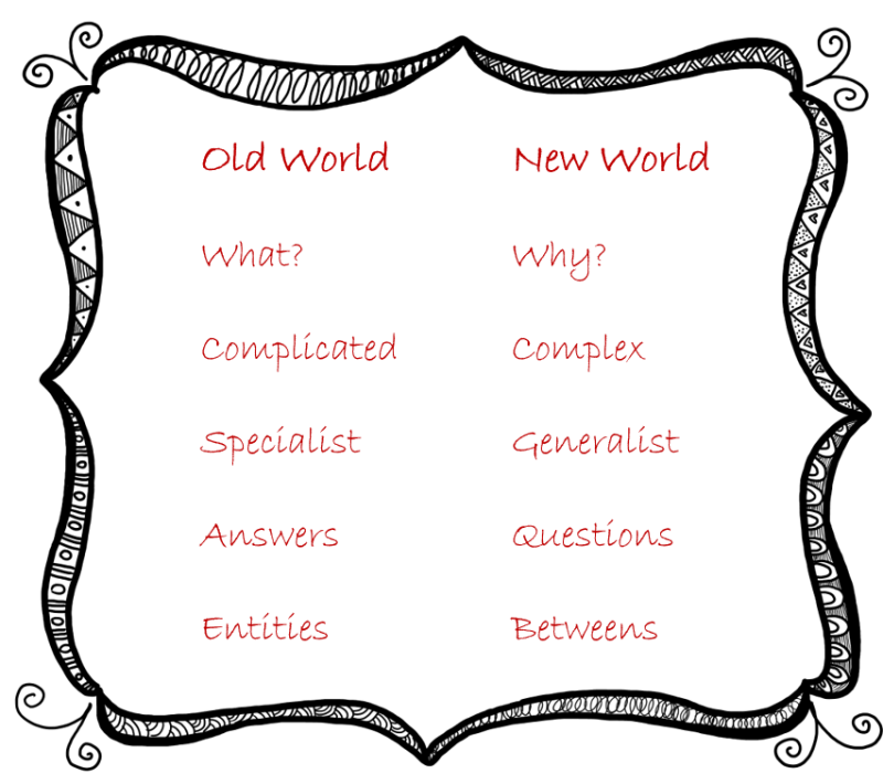
At the same time this is happening, the world is becoming more complex. Every problem is increasingly likely to be connected to every other problem. That then highlights another issue with the way technology is taught today. The complexities of inter-disciplinary, interdependent problems makes for a really bad fit in an academic world that is still taught in tight specialisations. And which, more critically, tend to inherently avoid the ‘human’ issues that can no longer be excluded from whatever challenges are being worked upon. Without wishing to delve too deeply into technology cliché-land, I think its fair to say that most technologists (‘geeks’ to use the modern parlance) become technologists as a means of avoiding as many of the complex human-relationship issues as they can. Pure technology problems (if such a thing exists any longer) have the possibility to be merely complicated. Which means there is the potential for a ‘right’ answer. Real technology problems, however, are complex. Which means there is no longer such a thing as the ‘right’ answer any more. As far as I can tell technology educators are either not aware of this shift, or, more likely, have no desire to become aware of it. As a consequence, they do their students an enormous dis-service.
Finally, let’s add one more big challenge into the technology education mix. Back to the idea of the expansion of knowledge for a second. Even if it is the case that the rate of creation of ‘new’ first-principle knowledge is slow and essentially linear, the fact that it is increasing at all inevitably means that the number of combination possibilities increases exponentially. Which means we find ourselves back in complex territory again. And another technology education shortfall: almost no curriculum I’ve seen has even started to think about – never mind solve – the issue of how to combine partial solutions from different domains.
Except, of
course, TRIZ. Which, sadly, brings us back full circle. As I experienced at the
University of Bath, the vast majority of the technology education community either
has no knowledge of TRIZ, or has no desire to acquire said knowledge. If they
did, it would offer a solution to many of the innate problems of today’s
technology education dysfunction. Which I believe can be summarised as follows:
Virtually nothing gets taught from first principles anymore, so students don’t understand the world at a first principle level. This means they often know what to do (what the computer tells them) but have no idea why. TRIZ, by asking the questions that it did – accidentally – gave the world a comprehensive database of first principles.
Students are taught how to answer questions rather than ask them. Finding answers is a much easier job today than it was 40 years ago. Today’s technologists need to be taught how to ask better questions. TRIZ helps to do this through the discovery that technology evolution has a very clear direction, and that progress occurs through a series of definable discontinuities.
Nearly all modern problems involve people somewhere, and hence all are complex. Meaning that teaching students how to solve only complicated problems is no longer sensible.
The world of technology is now massively hampered by extreme specialisation. The 20th Century was the time for specialists. The 21st Century technologist needs to be a boundaryless generalist.
The best solutions to any complex problem almost inherently emerge from a combination of partial solutions. Few if any students are taught how to explore and make sense of the potentially billions of combinations to converge on solutions that are both coherent and meaningful. Understanding how to make the right combinations means understanding how to deal with the ‘betweens’.
The new
curriculum is built to address these five core problem areas. It, in summary,
is about focusing on signal. By avoiding the task of teaching noise (a problem
endemic in the computing world, where lecturers continually fight a losing
battle against every changing languages and protocols), and instead focusing on
first principles, we become able to solve a crucial contradiction: We get to
teach a more comprehensive, useful and future-proof curriculum in a shorter
amount of time. That’s ‘useful’ in terms of benefit to the students, benefit to
their future employers, and benefit to society at large.
Module 6:
Energy – energy flow/transfer/losses/S-Fields
Module 7: Control
– sensors/feedback-loops/control-system-design
Module 8:
Users, Abusers & AntiFragile System Design – understanding humans and how
we interact with technology
Module 9: Real-World Projects – students will work with sponsoring companies on at least five real-world challenges to deliver actual, tangible-benefit-delivering solutions.
Module 10:
Dissertation – adding a new needle (‘signal’) to the global technology haystack
At the moment,
we’re looking to teach it either as a stand-alone two-year degree programme, or
a one-year option to help ‘re-orient’ students that have graduated from
existing technology degrees to help enable them to cope in the New World we’re
all now having to get used to.
Hopefully more news in the coming months. Job one: the tussle to win over a critical mass of technology educators.
It feels like my list of rules-of-thumb is growing. If someone asks me a question that piques my interest, it’s highly likely – assuming we (the SI research team) are able to reach a sensible looking answer – to generate a paper or an article or a blog post. If someone asks me a question that doesn’t pique my interest it gets filed. Filed until about ten people have asked the same question. At that point I feel I should probably do something. The question probably still doesn’t interest me, but the fact that multiple people have thought to ask it very likely does. I think this rule of thumb has kind of always been there, I just never explicitly thought about it. Maybe that’s a lockdown effect? Too much reflection time. Or maybe just lots of locked-down, bored people asking random questions?
Anyway, this week’s ten-time question concerned aesthetics. And specifically, is ‘make it beautiful’ a 41st TRIZ Inventive Principle?
Before I get
too much further, probably best provide the one word answer up front. No.
That’s not the
interesting bit.
In relating Principles to ‘beauty’ it is necessary, I think, to divide the story into two segments. One in which beauty is the solution, and one in which beauty is the problem.
Let’s start with the latter. One way of thinking about ‘beauty’ is that it is one of the desirable outcomes of some form of (human) activity. If we are seeking to achieve beauty, the question becomes, ’how do we do it?’ Taken from this perspective, the Inventive Principles offer up the full spectrum of possible ways to achieve what we are looking for. They are provocations and directions that will eventually (if we are persistent enough) give rise to beauty. In this sense, any of the 40 could do the job. From personal experience, and looking at the technical version of the Contradiction Matrix – where ‘Aesthetics’ is one of the Improving Parameters – we know that some of the 40 Principles are more likely to help deliver ‘beauty’ than others. Simple example: Principle 4, Asymmetry is frequently obervable in a photography context as the ‘rule of thirds’ – i.e. an image ‘looks better’ if it is not in the centre of the picture but rather is shifted so it is centred around one of the ‘third’ lines.
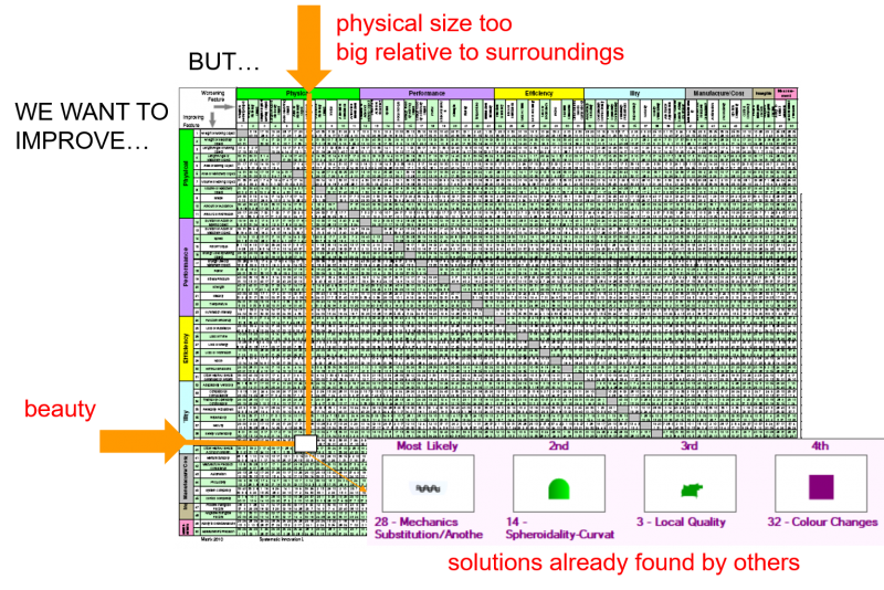
Or, by way of a classic architecture contradiction, the architect always seeks to make the buildings they design ‘beautiful’, but they also know that beauty can only be achieved in the context of the surrounding structures. Here’s what this problem might look like when mapped onto the Matrix:
At this point, the Matrix offers a ranked list of the most likely beauty-delivering solution strategies. So far so good.
The other way of thinking about beauty in the Principles context, then, is that it is the solution to a higher level contradiction. So, for example, I might have a contradiction formulated as something like, ‘I want to improve customer revenue, but my solution needs to be very cheap to produce’, look that up on the Matrix and be informed that ‘making it more beautiful’ would be a good solution direction to go and explore. It worked for IKEA I suppose.
In this scenario, IKEA aside, there is a case that ‘make it beautiful’ is a valid solution provocation. Taken in this context, the question becomes whether it justifies a separate Inventive Principle provocation of its own. In my view, the existing Principles already do the job as well as they need to. At least in a generic sense. Principle 38 kind of implies it. So do 16 and 17. But then Principle 35 becomes the real ‘get out of jail free’ card in terms of why ‘make it beautiful’ cannot be a 41st Inventive Principle – ‘Parameter Changes’ is a very (very!) general Principle and so covers a myriad directions.
Over the years, I’ve tried to get the TRIZ community to rethink the Principles. With, of course, zero success. Unless triggering angry emails from TRIZniks counts. Anyway, if I could, Principle 35 is the first one I’d look to change. When the chronologically generated Soviet list of Principles had grown to 34, I’m pretty certain that Altshuller and team looked at all the miscellaneous unclassified solutions that they’d accumulated, looked at each other, and asked themselves, ‘what do we do with these?’ And then, because no-one could come up with a good answer, they collectively shrugged their shoulders and said, ‘screw it, let’s just bundle them all together and call it ‘Parameter Change’. And so Principle 35 became this awkward hotch-potch orphan. The embarrassing relative we always seem to get stuck with on family occasions.
The best we’ve been able to do to solve this Principle 35 rag-bag problem is to do technical, software, business, architecture. Literature, etc versions of Principle 35 (with it’s A, B, C, etc sub-variants) so that it becomes more useful as a solution generation provocation than merely .’change something’. In this context, I have also suggested to almost everyone that I meet during workshops that they should make their own list of the 40 Principles, adding their own examples. Things that are meaningful to them personally. Which, if it makes sense in your specific context, might well include examples connected to ‘making it beautiful’ as a solution direction.
Meanwhile, for me personally, I know that if someone suggested ‘make it beautiful’ as a solution direction, I’d have two reactions. Number one, I’d think that any solution creator in any domain that is worthy of the label ‘creator’ already knows that aesthetics and beauty are a part of their job. Asking this person to ‘make it beautiful’ is about as useful as suggesting they make it ergonomic. Or long-lasting. Or any other trite statement of the obvious. Yes, I know, there are a lot of ‘creators’ out there who are not worthy of the label. ‘Helping’ them by giving them facile reminders of their job, sadly, does nothing to increase the likelihood of achieving a beautiful solution. The solution will still look rubbish because the creator was rubbish.
Second, and more important, comes the next level problem down the hierarchy. As soon as I remember that aesthetics are important and that I need to achieve something that is beautiful, there is very likely to be a dawning realisation, as i dig deeper into the details of the design, that my desire to create beauty is hindered by my parallel desire to improve another design feature. And at that point – realising that achieving beauty is the problem – all I need to do is reach for the Contradiction Matrix in order to tap in to the solutions of tens of thousands of better creators than me, and stand on their shoulders.
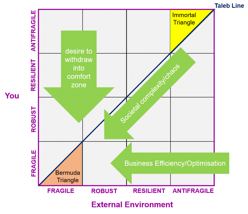
As we come to the end of the Everythink book project, I’ve been allowing my brain to drift into the next one. Which is currently looking like it will be the first of the antifragility series. To that end we’ve been playing around with ways to assess a person’s level of antifragility. In doing that, we’ve realised that its helpful if we can also measure the antifragility (or fragility) of the environment in which the individual exists. Their workplace, for example, or home and family. This second question has proven to be a tad more difficult to solve. I think we’re somewhere close. Close enough to think about how to present the data once we’ve calculated it.
In a blinding
flash of the ‘someone, somewhere already solved your problem’ obvious, it
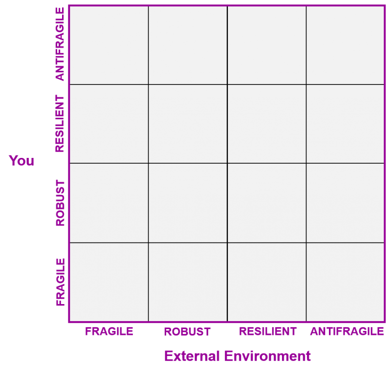
seemed that making a fragility version of the Complexity Landscape Model (CLM)
would at least offer a decent start point. Here’s what it currently looks like:
In keeping with the CLM story, we first needed to identify distinctly different levels of fragility. Distinctly different meaning a discontinuous (s-curve) jump between one level and the next. We ended up with three jumps and therefore four levels:
Fragile – the individual or environment is
unable to survive any out-of-the-ordinary perturbation (i.e. most enterprises
on the planet at this point in time)
Robust – the individual or environment has inbuilt safety margins that enable survival of a defined set of extreme perturbations. If these extremes are exceeded, failure will be ‘brittle’ – i.e. sudden, extreme and irrecoverable. Like glass.
Resilient – the individual or environment has inbuilt safety margins, but this time, if these margins are exceeded, failure mechanisms work slowly, such that any failure will be benign (‘fail-safe’), and such that there is a high likelihood of recovery. Like willow.
Antifragile – the individual or environment becomes stronger as a result of the stresses and other negative effects imposed upon them. Like the human body.
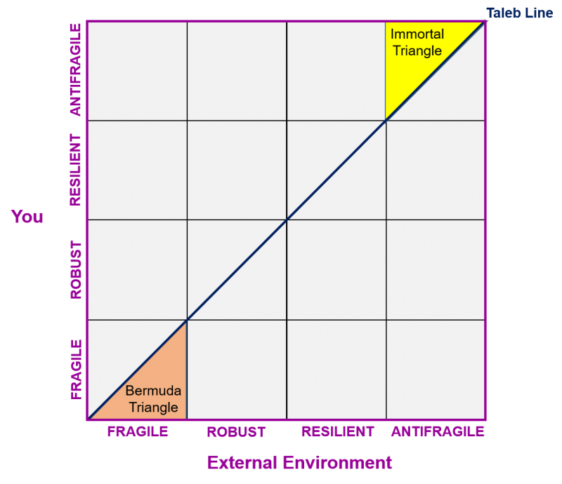
Next up, also aligned with the CLM, there are ‘good’ and ‘bad’ places to be when we map our individual and environment fragility levels. First up, it is a very good idea for the individual to have a higher level of antifragility than their surrounding environment. I.e. they should be above the Taleb Line. The overall best place to be, then, is in the ‘Immortal Triangle’ up on the top right hand corner of the Landscape:
This is pretty much the opposite corner to the one in which most people currently find themselves. Down on the bottom left is the ‘Bermuda Triangle’. Most people are here right now because that’s where their environment is. And, worse, likely as not, that environment is less fragile than they are. Especially, for example, if you happen to be a person one any kind of zero-hours work contract. Here’s an extreme example of what most employers tend to want from their employees: a slight underpinning tension that let’s you know they’re in control, and you’re not. This unpleasant situation not helped by the natural desire for all of us to stay inside our comfort zones. What we end up with then are three big forces all working to (unwittingly) make us highly fragile:
It’s a long way from the Bermuda to the Immortal Triangle, but that’s the journey we all need to think about making in the coming months and years. Welcome to the Pleasure Dome.
“If the government wanted people to drive safely, they’d mandate a spike in the middle of each steering wheel.” Gordon Tullock
I’m a slow learner, but one of the things I think I’ve learned since lockdown is not to try and have a rational argument with anyone on Twitter. Especially about PPE masks. A domain where there are far too many people with strong opinions and far too few with any actual knowledge. That’s knowledge as in either the realities stopping airborne 80nm diameter virus particles from entering the mouth or nose, or the usually less than rational quirks of human behaviour.
We live and learn.
Only without the learning part, usually.
The most vociferous faction of the pro-mask lobby assumes that ‘there’s no downside’ to wearing a mask so therefore everyone should wear one. In the real world, meanwhile, there are, numerous, clear downsides should anyone care to spend more than five minutes thinking about it.
Masks, in economist, Gordon Tullock’s world, are the opposite of what has come to be known in engineering circles as a Tullock Spike. A Tullock Spike is something that looks dangerous, but instead works to increase safety. Next time you find yourself unlocked and out in a car, if you can imagine driving along with a Tullock Spike half an inch from your chest, you are going to drive much more safely than if you’re in a Stage 1, 2 or 3 autonomous vehicle, swigging Red Bull, and surrounded by a dozen airbags. Counter-intuitive, but demonstrably true. Except for the Red Bull bit.
Masks make people feel safer than they actually are. Unless, of course, they are NBC hazmat-suit grade protective equipment, in which case virus ingestion becomes the least of your problems (not drowning in your own sweat usually being the most pressing one). If you’re wearing an N95, you are not nearly as safe as you likely feel. And if you’re wearing a home-made mask, the misunderstanding becomes even worse.
So, this weekend’s challenge is to come up with a concept of a Tullock Spike for Covid-19: something (not that it has to be a ‘thing’) that makes people feel ‘unsafe’, but as a result, makes them actually safer.
I’ve got a target of 10,000 words to write for the next book over the weekend, but I’ve also promised myself I’ll think about the problem and publish what I come up with early next week. All thoughts and contributions welcome.
Its only a matter of time before any kind of measurement gets gamed. With several of our clients, if we’re not able to convince them to go with what we think is the ‘right’ (i.e. outcome-based) kind of measurement, we at least try and help them to work out what the half-life of the measurements they intend to put in place are. So that they know when they need to start thinking about re-designing that measure. Lots of companies, for example, put into place metrics relating to the number of patent applications different departments (or in some cases, individuals) were expected to submit per year. This kind of measure typically takes about one-cycle (i.e. around a year) before it gets corrupted: ‘It’s November, we failed our target last year and got reprimanded; it looks like we’re not going to hit it this year either, so…’ You know what’s coming next.
We had a theory that metric half-life (i.e. the amount of time it would take for half the stakeholders to work out how to corrupt the measurement) would reduce considerably during a crisis period. We just didn’t know how much. On the last day of April, we got our first datapoint. And the news wasn’t good. The half-life of the Covid-19 virus test metric, we now know is significantly less than a month.
On the second of April, Health Secretary, Matt Hancock, announced, ‘I am now setting the goal of 100,000 tests per day by the end of this month. That is the goal and I’m determined that we will get there’
On the 30th came deliverance. 122,347 tests. Very impressive. Hancock looked almost smug when he showed up for that day’s media briefing session.
Execpt. There was a problem. Several problems. 27,497 turned out to be ‘home tests’. Tests that had been posted to people on the 30th. Another 12,872 were sent out to satellite sites. So they also weren’t actual tests either. So the 122,347 was actually just 81,978 by the 2 April definition. Then we learned that the number of actual individuals actually tested was 73,191. This because the tests aren’t massively reliable, and so large numbers of individuals had to be repeated. And then, worse still, now we also have figures for the early days of May, we also know that the 30 April figure was a one-off high.
I’m not blaming Matt Hancock for this corruption. He’s just the poor sap that set a target he didn’t understand. And he’s just the Minister putting pressure on everyone beneath him to make sure the target was met. A classic, ‘don’t let me be seen to have missed this target’ kind of pressure. Pressure that meant, as soon as said staff worked out they were going to fail, they were forced to start getting creative. Some kinds of creativity are good. But, generally speaking, not the kind where stupid things get done in order that some arbitrary target is reached.
So, May 5th, and here we are. The half-life of a UK Government metric looks like it is, if we take into account the time until someone worked out that posting home-test kits on the 30th might help, is around a fortnight. And yet still somehow the Government approval rating is above 50%. Which, if I had any faith that that particular metric hadn’t been corrupted several eons ago, I might start to worry about.
What we’ve managed to do with the clients that have had their ‘number of patent applications’ metric gamed is helped them to introduce a better ‘number of hgh quality patent applications’ measure. It’s hard to measure ‘high quality’, but the difficulty of doing it should be no impediment to working out how to do it. The same applies regarding virus testing. It shouldn’t be about how well the Government sends out unreliable home-testing kits to random individuals (and, by the way, I know from several friends that there is a massive element of randomness), it should be about the number of high-quality test results obtained. I think, maybe, everyone assumed that’s what Matt Hancock meant on April 2nd. That part of the measurement challenge isn’t rocket science. We all instinctively know what meaningful is. We just need to get those responsible for making the measurements re-direct their creativity away from gaming the system, and towards finding ways to measure what is needed rather than what is merely expedient.
I’m ploughing
my way through Volume 1 of Design Unbound at the moment. A bit of a complex-adaptive-systems
buzzword bingo game of a book if I’m being honest. With so many ‘insert miracle
here’ moments, by page 150, I found myself laughing out loud.
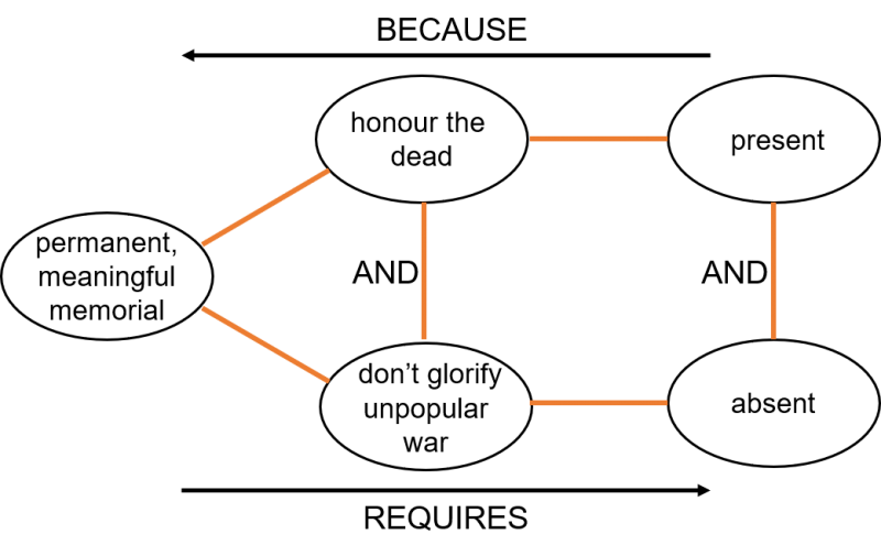
On the up side, though, the authors mention the word ‘contradiction’ quite a lot. They’re not brave enough to come out and say that contradictions should be ‘elminated’, and they don’t quite go so far as to say ‘challenged’ either. But they do talk about the need for designers to embrace ambiguity, which is quite nice in its own right, and at least a step in the right direction. Part of my problem with the book, I think, is the lack of examples of what’s been talked about. So it all comes across as very ethereal and, ultimately, little more than an advert to go and do an architecture degree. There were, however, a couple of quite elegant examples. My favourite concerns the beautiful Vietnam War Memorial in Washington DC. As it turns out, a classic architecture conundrum. On the one hand, the Vietnam War was probably not the US’s finest hour so in a lot of ways, people want to forget about it. On the other hand, close to 60,000 American military personnel lost their lives and visibly commemorating those tragic deaths was something that was considered vitally important to all those that fought or had loved ones lost in the conflict. A memorial was wanted and not wanted.
In TRIZ terms,
the contradiction looks like this:
And if we map
it onto the Business Matrix – where we have the biggest selection of ‘intangible’
parameters to choose from, the best fit says that what we’re trying to improve –
honouring the dead – is all about Meaning, and, the other side of the conflict –
not wanting to glorify the unpopular war – is best mapped as a Negative
Intangible, or, possibly, next best, Trust. Here’s what happens when we map those
pairings onto the Matrix:
And here’s what
the architects of the Memorial came up with…
…a stunning example of a (Principle 32) ‘increasing transparency’ solution. Looked at head on and the Memorial is a highly polished black marble, with the names of the lost engraved; looked at obliquely, and the Memorial ‘disappears’ by mirroring its environment. Monument and no monument.