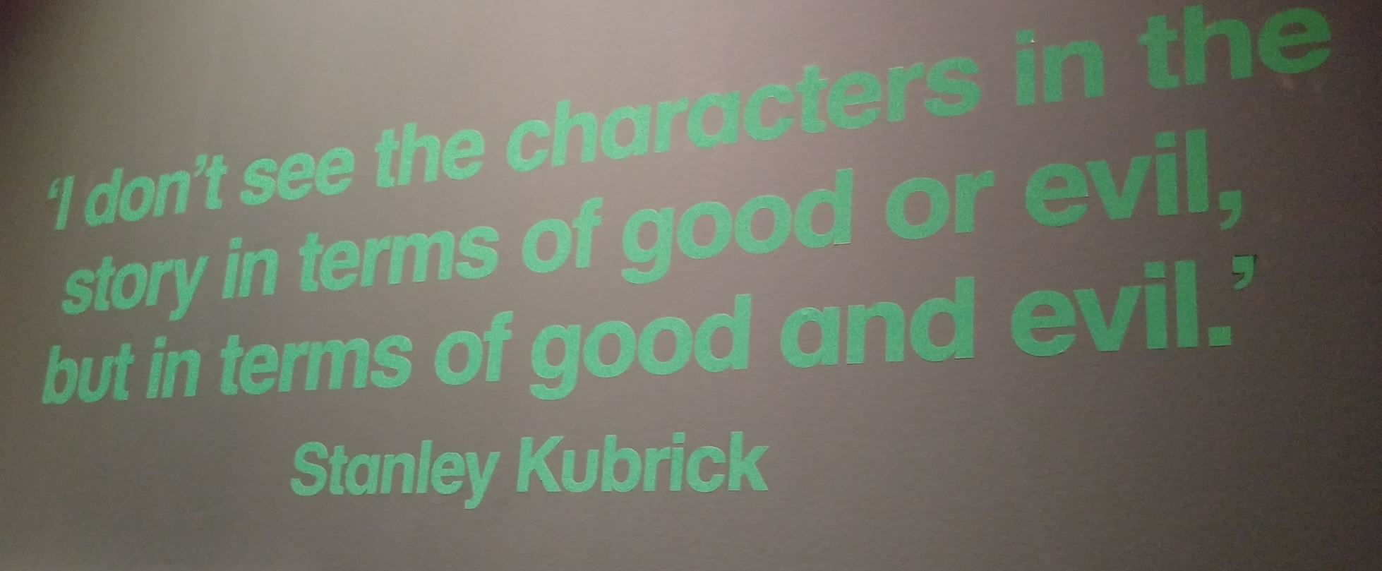
I spent most of Saturday afternoon at the Design Museum in London. Three-quarters of the visit was awe-inspiring and quite brilliant. The other quarter was depressing. The three-quarters part was the Stanley Kubrick exhibition, which I would heartily recommend anyone takes a few hours to go visit should it visit a town near you. Or even not near you.
The other quarter was everything else in the Design Museum. Before Saturday, I thought the best way to make myself angry was to spend time at academic conferences. Now I know it is visiting the Design Museum. In fairness to other design museums, specifically, the London version. The one in Copenhagen, by contrast, I thought was full of ideas. Well, I suppose the London version was full of ideas too. But whereas I left the Copenhagen museum with a notebook full of good ideas, my notes from London were pretty much all about how idiotic most ‘designers’ are.
I’m guessing a big part of the problem is curation. The curators at Copenhagen seemed to have a very clear grasp about what design is. After my visit there, I drew this:
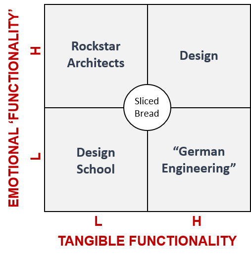
Everything I saw in London was built on the assumption that the feel/function relationship is some kind of an ongoing either/or debate. Here’s a room full of random stuff that was very functional. And over here is another room, this time full of random stuff that looks pretty. The end result being that it all looked like a collection of random stuff that only by accident ever achieved ‘both’.
The confusion extended, too, to the design of the Museum itself. I’m guessing that whoever got the commission for the building and its fixtures and fittings was setting themselves up for a fall no matter how good a job they did. Designers can be spitefully cruel critics. I can empathise with that. I’d have to say that the aesthetic end of the either/or spectrum would probably be happiest as they walked around the London Design Museum. How that bias was allowed to continue into the rest-rooms, however is beyond me. Yes, they look pretty, but if there’s one place functionality is important, it’s a rest-room. Having to put up signs informing users how to wash their hands is a good indication the sink design is functionally rubbish.
The crowning example of how the London museum curators don’t understand ‘design’, however, hits you the moment you enter the building. You see this monstrosity:
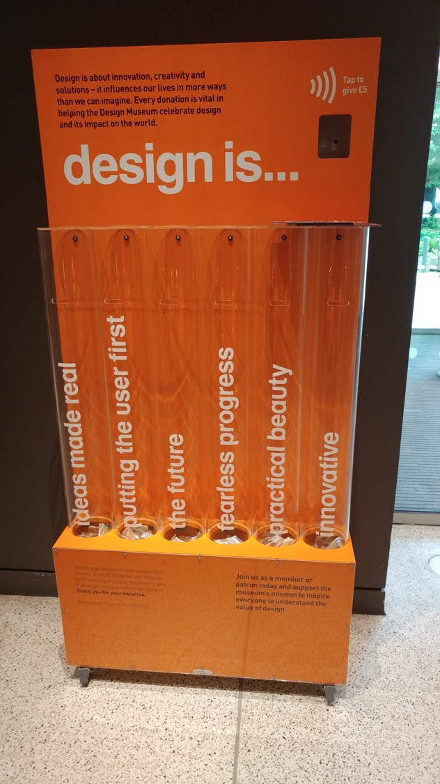
It’s tangible aim, I guess, is to get people to donate money to the museum in a way that is – in theory – informative, and – bit more of a stretch – encourages some kind of thought process to take place. Is design ‘ideas made real’? Or ‘putting the future first’? Or ‘fearless progress’? Or… well, you get the idea. The key one being the implied word ‘or’. The moment we force people into either/or decisions we’ve just asked them to answer the wrong question. All we’re going to learn when we ask these questions is how to optimize the annoying compromises we’re about to ask our customers to make. And that, as Stanley Kubrick will tell you, has nothing to do with design at all…