I was speaking at a CIO conference last week, feeling a bit nervous that I was about to suggest that their collective Big Data efforts were delivering zero value. I needn’t have worried. They already knew.
Considering the Big Data industry invoiced $20B last year, that’s quite an admission of failure. Almost enough, one might guess, to merit some kind of investigation. On that point, however, I suddenly felt very much alone again. Everyone I spoke to seemed to reluctant to dig deeper.
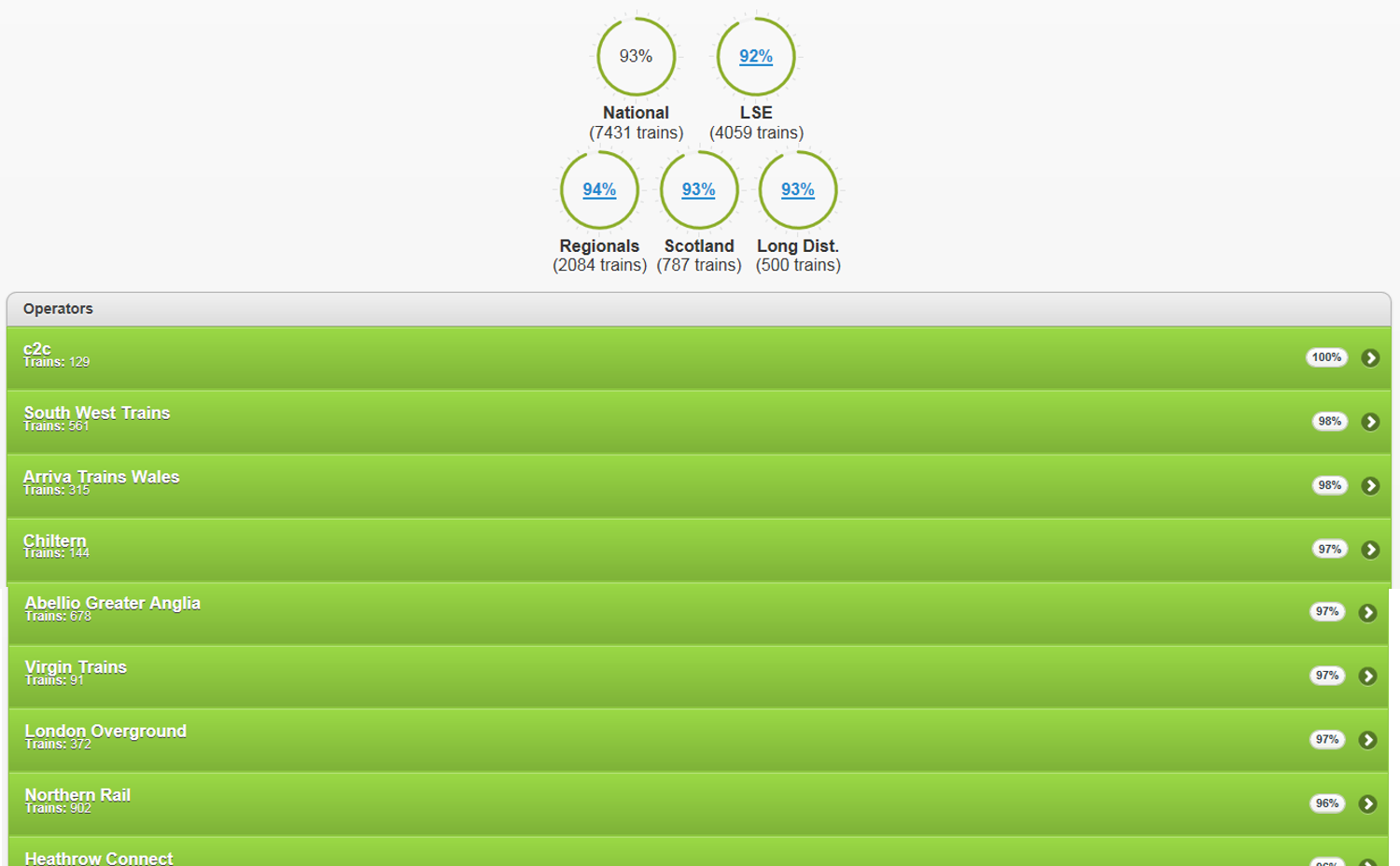
Take a current UK example. liveppm.com is a website that allows the British public to see a moment-by-moment update on the punctuality of trains on each of the country’s networks. From a purely technical standpoint – every time a train departs and arrives at a station anywhere in the country it’s performance is instantly updated on the site – its inconceivably impressive. From a ‘does it do anything useful?’ perspective, on the other hand, it can only be seen as a pointless waste of taxpayers money.
Now I’m not totally blaming the IT professionals that built the system: they were given a brief and they executed it in spades. A bigger portion of the blame, one suspects, has to head in the direction of the Rail Regulators – the people tasked with making sure the taxpayer’s money is being wisely spent. On one level, checking how punctual our trains are serves might serve some kind of useful purpose. At first blush, I have no argument with the collection of punctuality data. It’s difficult to know if you’ve improved a system if you can’t measure what’s happening. It’s only when the information is used to set targets that the problems start. Setting arbitrary targets in order to impose penalties and generally beat people up destroys value and becomes an impediment to improvement. That’s because all the targets ultimately serve to do is encourage operators to improve the way they cheat reality in order to make the figures reflect better on them.
Meanwhile, the poor old commuter is paying for the whole downward spiral sham. Both directly in terms of the millions it cost to set up and maintain the system, but – far worse – indirectly in that it provides them with absolutely nothing that allows them to make any meaningful travel decision. The system is an expensive needle-less haystack. Learning that the 92% punctuality record of an operator today only means something if I have the choice to use another, higher performing, operator. And even then I have no idea whether the performance of my operator will be any better or worse tomorrow. Not that the majority of us have any choice either way. If I live in rural Devon, I can’t elect to catch a London Overground train. Tangibly, the punctuality data is useless to the commuter. Intangibly it is far, far worse because it adds frustration and annoys anyone that cares to look at the data because it leaves us with a feeling of utter powerlessness. That (twist the knife why don’t you) we’re paying for.
In all these respects, it’s a highly typical Big Data ‘solution’. The Data is only ever of any use if it reveals actionable insight about a situation. Insight is the needle in the haystack. Insight in the case of train punctuality is enabling the commuter to make decisions about whether they should bother to leave the house today. Or to take the car or bus instead. Or stay in bed five minutes longer because the specific train they intend to travel on is running late. Or, lest the train operators might also wish to do something vaguely useful with the information, allow them to put in place actions to improve performance of the network. Those are needles. Needles are difficult to find because they require seekers to go beyond what is merely easy to measure. Measure the wrong things (train punctuality), for the wrong reasons (to punish operators with a poor punctuality record) and while you might end up with a multi-million pound size haystack, it sadly contains no needles at all.
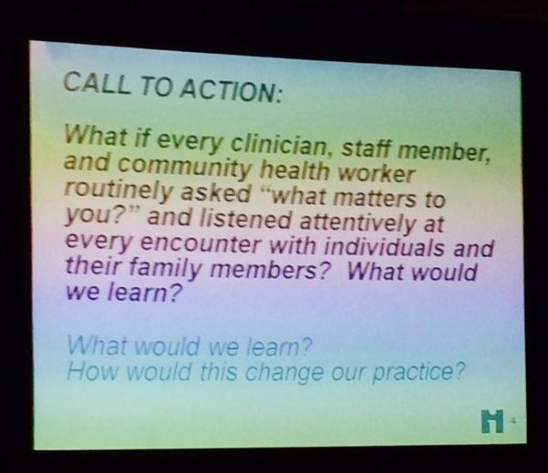
At a healthcare conference today, someone deemed it a good idea to put this slide up on the screen:
What I like about it is, someone is at least thinking about asking for a patient’s opinion.
What I really don’t like about it is the naivety of the question. First up, ‘what matters to you?’ is precisely the sort of question that guarantees a meaningless answer. It’s supposed to try and tap into people’s emotions, but, as the FMCG industry has known for the last decade, ends up doing the exact opposite. It’s precisely the sort of question that has people lift their eyes to the ceiling trying to work out how to fob you off with the quickest answer that will get rid of you. A lot like what we all do when a waiter comes up to us in a restaurant and asks us whether we’re enjoying our meal. Few if any of us tell the truth.
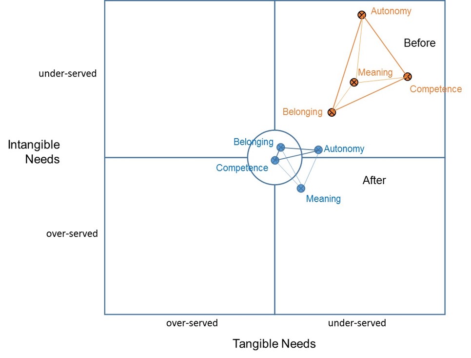
Second, and much more important, the main reason there’s no point in asking the question is that we already know the answer. When we try and tap into what drives people’s behaviour we know that there are essentially just four drivers:
And, frankly speaking, the healthcare system universally makes all four of them worse:
Autonomy: the moment a patient steps inside a hospital they just handed over control to someone else
Belonging: the fact that the patient is ill means they no longer feel part of ‘the tribe’
Competence: the healthcare system has unwittingly created a population of learned-helpless people that have no idea what is going on when it comes to the working of the healthcare system
Meaning: an awful lot of the form-filling and other bureaucracy activity the patient sees is utterly meaningless to them.
When people like Steve Jobs stood up and said, ‘I don’t need to go ask the customer what they want’, it wasn’t arrogance it was an innate understanding of these four drivers and the need for Apple’s products and services to make all four of them ‘get better’. It’s exactly the same in healthcare: what matters to patients is giving them more Autonomy, a greater sense of Belonging, a feeling that they are Competent, and that anything that happens will be Meaningful. It’s not rocket science.
The most delusional industry on the planet is the one populated by so-called ‘creativity consultants’. They seem to be under the collective mis-apprehension that their clients are short of ideas. The second most delusional industry on the planet is the one responsible for creating and selling ‘idea management solutions’. Usually to the same clients that thought they were short of ideas.
In theory, it makes for a cunning one-two: one, ‘we seem to be lacking ideas’; two, ‘best bring in an idea management system to cope with all the ideas we receive once we have inspired everyone to start generating lots of them. In practice, it’s a bit like a tattoo studio selling clients a tattoo-removal saw in case they have a future change of heart.
For the last decade, ever since I’ve been asking the custodians of these idea management solutions the question, not a single one has been able to convince me that their system has added even the smallest iota of tangible or intangible value to either the business or the poor souls who typed the details of their precious, fragile idea into the stupid system. To use another uncomfortable metaphor, we might just as well have cut a slot onto a toilet seat lid and labelled it ‘suggestions’. We might have had to unblock the outlet pipes once in a while, but otherwise, everyone would save a heck of a lot of idea management system adminstrators. And their supervisors. And the army of idea management software vendors that seem to be so desperate these days I need a machete to cut through all my idea management system spam mail.
The heart of the issue is this. The last thing a good idea needs is ‘managing’. Granted, any idea when it first appears is fragile. But if it’s any good, no-one that hears it is ever going to forget it. What it needs is nurture. And leadership. What it doesn’t need is to be pigeon-holed in some software geek’s idea of an idea factory farm.
Only bad ideas need to be managed. And frankly, the best way of managing them would be to cut actual, non-metaphorical slots in all the toilet seat lids in the company. Huh? Have I just taken myself full circle. I got it wrong the whole time. The real purpose of idea management systems is to formally dispose of and kill the myriad bad ideas that would otherwise have distracted everyone from the serious business of nurturing the tiny minority of good ones. I apologise.
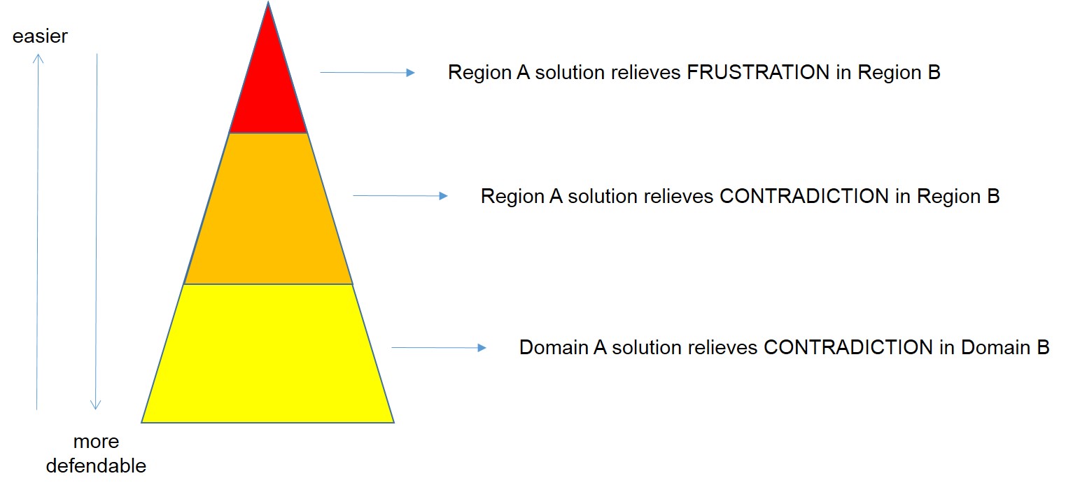
A lot of organisations talk about the size of their innovation attempts in terms of hops, steps and jumps. The accompanying logic is that the ‘low-hanging-fruit’ hops are ‘easy’ and the ‘breakthrough’ jumps are difficult. To a large extent that perception is correct. But it’s also a contradiction, and therefore an innovation opportunity in its own right. Solving the contradiction would mean something of a business holy grail: ‘easy breakthrough’.
The main precept of Systematic Innovation is ‘someone, somewhere already solved your problem’. Which means there must be examples of these kinds of low-hanging fruit jump innovations out there. And sure enough there are plenty to be seen. Spend enough time analyzing them all and a pretty clear theme begins to emerge: so far there are three ways to create a ‘low-hanging breakthrough’:
The easiest of the three is all about a geographic transposition: A proven solution from Region A is introduced into Region B and is successful because it removes or reduces an underlying customer frustration present in that region. Typically all that is required to make these kinds of translation into a success is a big enough marketing or messaging twist to overcome any issues of IP (principally copyright) infringement.
The middle of the three is another variant on the geographic transposition. This time, a proven solution from Region A is introduced into Region B and is successful because it resolves a contradiction experienced by customers in that region. Solving the contradiction typically involves another twist relative to the original solution, but this time the product or service itself (as opposed to just the messaging) is very likely to change. The phenomenal success of probiotic yogurt drinks like Actimel in the West in recent times represents a great example of a simple pair of contradiction-solving product design twists on the original solution, the Turkish drink, kefir. The twists in question being: make it taste nice and make it ultra-convenient.
The third low-hanging-breakthrough category we can see lots of examples of is about a transfer of proven solutions from one domain to another. A solution in Domain A is used to solve a frustration or, more usually, contradiction in Domain B.
As with all things in life, whenever we solve one contradiction – easy breakthrough in this case – the next one quickly reveals itself. In this case it probably has something to do with the likely longevity and protectability of the new solution. If all you’ve done is given a new name twist to a product you discovered on the other side of the planet, then by all accounts it will be easy for anyone else to do the same thing. But then, hey, that’s merely a contradiction too, right? And someone, somewhere will already have solved that one for you too. The main trick, as ever, is staying one contradiction ahead of everyone else. The less obvious, but probably more important precursor is developing the capability to map and track the contradictions and frustrations of potential customers in other Regions and Domains to yours.
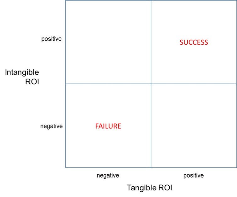
It feels like there are a million and one ways to define ‘inovation’, but the one we here in Systematic-Innovation-Land typically end up using is ‘successful step-change’. Simple enough, but still plenty to cause a deal of confusion when we try and apply it in a specific organisation. The main problem usually comes with the word ‘successful’. Probably because the word puts the onus back on the project team to define what success means to them. The generic idea at that point tends to distill down to some form of net value addition, but specifically, I would say that in nearly every case – certainly in the commercial world – we find ourselves deferring to the accountants in the room and their desire to see a positive Return On Investment: the ratio of the net receipts back from customers over how much money was spent to get there. Simple again. Except, it misses at least half of the story. ‘The most important numbers are unknown and unknowable,’ so said W Edwards Deming in his gruff attempt to get the accountants to wake up and recognize the presence of all of the emotional and intangible issues that inherently weave their way in to any innovation story.
Any meaningful measure of innovation success, I believe, needs to take due account of these intangible issues. I also believe that the late great Dr Deming was largely wrong when he declared they weren’t measurable. They’re merely more difficult to measure than stuff like dollars and cents.
The simple act of allowing ourselves permission to contemplate the possibility that in the innovation intangibles can be calculated should permit us to draw grids like this:
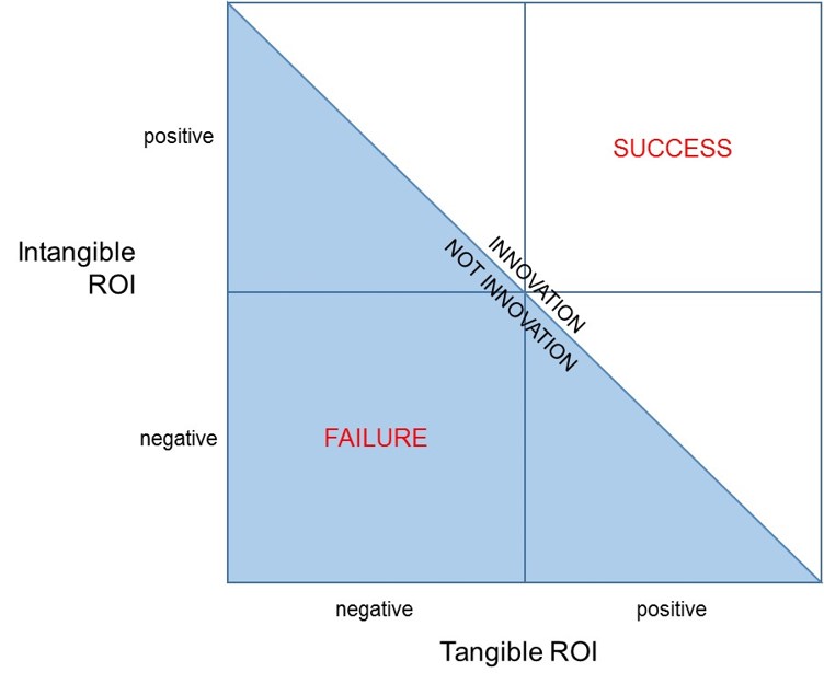
Assuming it then becomes possible to somehow cross-calibrate and connect tangible and intangible ROI (a fairly big assumption, granted, at this point), it becomes possible to get a more complete definition of what innovation is: the boundary between innovation and not innovation corresponding to a diagonal line drawn from the top left to the bottom right of the grid:
Everything above this line we can see is an innovation because the combination of tangible and intangible ROI is net positive, and everything below is not because the combination is negative. The diagonal line also allows us to think about and define four triangular areas. Here’s our current attempt to do that job:
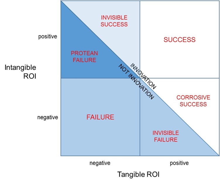
Which nows gives us six possible innovation ROI scenarios:
Success (where we’d really like to be) – ROI from both tangible and intangible sources are both positive, and hence the success of the attempt is unequivocal.
Failure (where we really don’t want to be) – ROI from both tangibleand intangible sources are both negative: we didn’t win on either count.
Invisible Success – as in ‘invisible to the accountants’ – the project did not make a positive return against their tangible ROI metrics, but the intangible ROI actually turned out to more than offset the negative tangible figures. This is the innovation project we thought had failed, but once we took due account of all of the issues, we should actually have called it a success.
Invisible Failure – represents the converse of invisible success: this is a project the accountants and tangible figures told us had been successful, but sadly, after taking into account the negative ROI for the intanigbles, we should actually have described the project as a failure because our customers were emotionally worse off than before we turned up with our bright idea.
Corrosive Success – a situation where the tangible figures tell us we’ve been successful, but the ROI from the intangibles was unfortunately a negative number. Not so negative as to completely wipe out the tangible gains, but a corrosive problem because we got the intangibles wrong and therefore most likely planted some unfortunate negative emotion seeds in the minds of customers. Seeds like loss of good-will, loss of trust, ‘you trapped me in your eco-system’, etc, that make it much more difficult for the next round of innovators in the organisation to succeed.
Protean Failure – another segment that has to be seen as a failure, because overall ROI when we totaled up the tangibles and intangibles was negative, but we shouldn’t be totally de-moralised because we did actually get some of the intangibles right. And given that, right now, we all know far less about the intangibles than we do about the intangibles, in many ways we got some aspects of the most difficult part of the innovation story right. Which in turn is trying to get us to consider that a simple re-think in the way we presented our solution to the customer we might be able to get the project across the line and into the ‘innovation’ half of the picture. We use the term ‘Protean’ here in the sense that our best success strategy is to become fluid and adaptive (like the Greek God, Proteus) and experiment with different things until we find our winning ‘Plan B’.
So much for re-thinking how we define the ROI of an innovation project. It might be okay in theory to say that we can measure ROI in terms of the intangibles, the real test of the model can only come through a translation of that theory into practice. Which is where our PanSensic tools usually come to the rescue.
They have done so in this case as a result of a large piece of work to find ways of defining and plotting what we came to call the quartet of ‘human universal’ intangibles – Autonomy-Belonging-Competence-Meaning (ABC-M) – onto a map of frustrations:
Although still not easy to calculate (see Systematic Innovation e-zine, Issue 146 describes how we do it), once we’ve found a way then we have a means to calculate the benefits part of the ‘Intangible ROI’ parameter in terms of the delta between the (ABC-M) scores for each stakeholder before and after the innovation attempt. So that we end up with something like:
Where K is a constant that can be used to ensure the weight of the intangible ROI result is equitable with the (much more easy to measure) tangible ROI. Simple when you know how. Or, if not, keep your eyes peeled on the coming ezine issues, where we’re expecting to publish a case study or two. And maybe reveal a ‘was that really an innovation?’ surprise or three.
Full disclosure. I’m not a Coldplay fan. I’m probably in a minority. Close to a thousand people have taken the time to give the band’s latest album, Ghost Stories, a Five Star review on Amazon.co.uk. Here’s one of them:
5.0 out of 5 stars Beautiful, haunting and soporific album. Excellent! 19 July 2014
This review is from: Ghost Stories (Audio CD)
For those expecting something along the lines of “Mylo Xyloto” or “Viva la Vida”, this will come as quite a (hopefully pleasant) surprise. Coldplay have taken a break from the previous, more energetic style to create this reflective, soporific, often quite melancholy yet extremely soulful album. Haunting melodies and gentle rhythms run throughout, and the style though slower and more relaxed is still distinctively Coldplay. As ever, it is skilfully written and put together, and the mixing and sound engineering is unsurpassed. It is definitely an Album in the old fashioned sense with all the songs taking the listener on a musical journey with a beginning, middle and conclusion, and they all naturally complement each other.
Whilst it may not appeal to all Coldplay fans, particularly those who like the earlier albums rather than the later ones, the band has shown once again their capacity to evolve and innovate as they progress through life, but retain their distinctive style. Interestingly, some of the song structures do remind me a lot of the recent Avicii “True” album (which is also a favourite of mine). I urge you to take time out, sit down in a comfortable chair and just simply listen to it right the way through to fully appreciate it.
Normal (Level 1 or Level 2 on our BDA Capability scale) analysis of this review would tell you this person likes this album.
PanSensics will tell you:
This person has strong ‘pilgrim’-like opinions about things
Those opinions are weakly held
He is frustrated that people don’t seem to listen to him
He hasn’t listened to any of the words in the songs
He probably wouldn’t like them if he did
He thinks the band is stagnant
Is likely to describe the next album as a ‘return to form’ and declare this was the worst Coldplay album (unless, of course, the new one turns out to be even worse… in which case, he is likely to recommend people revert to the early ‘classic’ albums)
In a no doubt vain attempt to show that not all Big Data Analytics capabilities are the same, I thought I’d instigate a series of ultra-short case studies to hint at the sorts of thing our PanSensic tools have been designed to do. Like any BDA toolkit, PanSensics works best when we feed lots of data into the engine. That said, we occasionally even impress ourselves with the richness of the insight that can be gleaned from briefest of narrative data.
This first micro-study involved a scrape of Amazon reviews on electric toothbrushes. Including this one:
5.0 out of 5 stars Efficient, 25 April 2014
This review is from: Philips Sonicare HX6731/02 HealthyWhite Deluxe Rechargeable Toothbrush (Personal Care)
The first brush proved to be faulty after two weeks; however, when I returned it, the replacement was sent straight away and I received it four days after sending in the original product. The Sonicare does an efficient job of cleaning my teeth and, best of all, the timer forces me to spend two and a half minutes on my brushing and polishing. Before I got the product I used to spend a cursory half a minute on my morning and evening ritual; I have currently noticed a brighter smile and a cleaner feel to my teeth. Now I can follow my dentist’s recommendation and won’t feel guilty at my regular visits.
Normal (Level 1 or Level 2 on our BDA Capability scale) analysis of this review would tell you this consumer is happy.
PanSensics will tell you:
This person is naïve, an ‘innocent’
Impulsive
Needs to see data to be convinced
Is actually quite angry
That there’s a significant ‘clean faster’ innovation opportunity
Probably won’t buy a Sonicare next time
If you’re interested in finding out how PanSenic is able to make this assessment, check out the website and give it a go yourself.
With some commentators suggesting that the Big Data Analytics industry will do over $20B of business in 2015, it feels a little duplicitious to suggest anything other than that the industry has become an enormous success. On the other hand, perhaps ironically, it would also appear that the industry is not so good at measuring the tangible success it is delivering to its customers. Or maybe the truth is they don’t want to know.
My suspicion is that were anyone to calculate anything like genuine, meaningful Return On Investment outcomes, we’d discover that the actual value being delivered to customers is somewhere close to zero.
It all depends on how the calculations get made of course. Take my visit to Amazon yesterday to purchase a book someone recommended I should read. As ever, not long after I’ve found the book in question, Amazon is hard at work recommending other things that I might like to buy. ‘If you like that book, we think you’ll like this one even more.’ The fact that I agreed with them on this occasion is very likely to have the Amazon Big Data analysts claiming another success story. They successfully pointed me towards a book I didn’t know about and offered it to me at a price that, after I’d done my usual due diligence check, made it feel like an easy purchase decision. But was this really a Big Data success story? Or was it merely getting me to an important book I’d didn’t know about sooner rather than later?
The heart of the problem here is how the Big Data world takes account of the foibles and complexities of customer minds. And therein lays the real problem with today’s Big Data analysts. They’re good at analysing easy to access data (25% of people who bought this book also bought this one) but they have little or no idea how complex systems work. And particularly the rather awkward matter concerning the inextricable links between what we measure and the solutions that are expected to result. You can only know what to measure, in other words, if you know what the response you’re trying to design is going to look like. Designing measures in a complex system involves a classic chicken-and-egg conundrum. If that sounds counter-intuitive to you, you only need to think about a typical design cycle to see that, woah, it’s a cycle. The head connects to the tail so that no-one knows where the head is any more. Some projects might start with a measurement, but others might equally well start by guessing a solution and then measuring what happened to it.
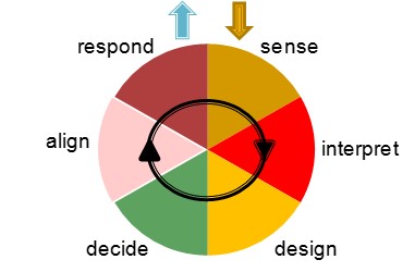
In the world of complex systems it is not good enough to be merely good at ‘Sensing’. You have to know how to Interpret, Design a response, Decide that it’s appropriate, Align the team and then execute a Response.
The ‘system’ requires all these elements, but the two that demand the polar opposite set of skills are Sensing and Designing. One is about analysis; the other about synthesis. Because the Big Data world tends to attract the former, it tends to be awful at the latter. The problem usually then becomes exacerbated because the Big Data analysis work is often out-sourced from the client organisations that are going have to do something with the results. Now you have a situation where the Analysts and the Synthesists are on opposite sides of a big silo wall. And so the blind find themselves being lead by the ignorant.
The point of this rant? With our PanSensic toolkit the Systematic Innovation team now finds itself sitting in the middle of what feels like a very crowded Big Data Analytics space. Aside from the cool measurement tools we’ve been able to build, I humbly suggest that our main uniqueness when we’re working with our clients is that our DNA sits on the Designer/Synthesist side of the spectrum. We spend most of our lives designing solutions. And because that’s where we come from, that’s what’s allowed us to gain the insight we have into knowing what the ‘right’ things to measure are.
99% of Big Data measurmeents, by our reckoning, are completely pointless because they offer zero insight into what design levers need to be created or pulled to make a difference. Hospitals spend millions measuring A&E waiting times, railway operators spend their millions calculating how punctual their trains are, supermarkets spend their millions measuring what went into my trolley this month, but all three measurements are thoroughly pointless when it comes to presenting any actionable change response. All their beautiful graphs, especially with the hospitals and railways, merely serve to frustrate both staff and customers, because none of us can see any kind of connection between the result and any kind of lever in or around the system that we can adjust to make the results look better next month.
So, how about this as a potential way through the rat’s nest of Big Data Analytics conundrums. A suggested trio of questions a leader should ask prospective Big Data providers before they write their Big Data Cheques:
Show me evidence to demonstrate that you understand how my business operates as a Complex Adaptive System
Show me evidence of success stories from other clients where you are able to demonstrate a clear information flow path and cycle time from measurement through Interpretation, (especially) Design, Decision, Alignment and a successful Response.
Show me evidence of a back-to-back, double-blind trial in which your Big Data Analytics approach was demonstrably better than the placebo.
And, by way of a final coda, if they think they can answer questions 2 and 3, it probably tells you they didn’t quite understand Question 1.
In the spirit of not re-inventing wheels, the SI research team have spent some time in recent months looking at how the service industries measure their innovation activities. To say that search has ended in disappoint would be something of an understatement. Put crudely, no-one in or around the service sector seems to have the first idea how to measure the impact of their innovation efforts. What does exist seems to fall into two basic camps. In the first camp, ‘measuring service innovation’ seems to mean surveying people in the service sector to see how well they think they’re innovating. This seems like a fundamentally flawed way of doing things to me. Firtly because the survey instruments don’t define what they mean by innovation, and secondly because it’s difficult to imagine a scenario in which respondents would have any desire to answer the questions honestly. All in all, the whole exercise resembles a study asking gamekeepers to rate their poaching abilities.
The second service innovation measurement camp appears to have worked out that it’s a difficult problem and that ‘somebody should do something about it’. The most pro-active members of this camp appear to have tried running competitions to see if anyone is up to the challenge. As far as we can tell, no prize money has been handed out.
Given that the GDP of many developed nation is now heavily dominated by the service sector (in the UK, US and Australia it’s already over 80%) it somehow seems a little odd that no-one knows how to measure their future lifeblood.
In these kinds of situations, we’d normally expect to begin solving the problem by trying to define what the ideal solution would look like. Based on our definition of innovation as ‘successful step-change’, a meaningful measurement ought to be based on an ability to define and measure ‘success’. This might mean return on investment – something like ‘how much did we invest in creating our new service offering, versus how much did we get back in terms of new revenue from customers – or some form of net value addition. Or jobs created. Or maybe even money saved. All sound both logical and plausible. Except for a couple of awkward facts. Firstly the fact that the service sector is inherently embroiled in and surrounded by complexity. Which means that it is difficult if not impossible to reliably connect causes and effects. Any change made to a complex system is prone to a host of unintended consequences. One part of the system, in other words, might get rewarded for successfully getting butterflies to flap their wings faster, while another ends up becoming the victim of a surprise hurricane. A bit like when the UK Government ‘innovated’ after the 2011 riots in London and locked up the gang leaders. A big tick in the ‘no more gang leaders’ box. A big disaster for everyone else when the power vacuum left in the gangs created a mass of new work for the police trying to calm the ensuing intra- and inter-gang warfare.
Secondly, and perhaps even more significant, is a recognition that a very large proportion of how customers decide whether the ‘innovative’ new services they’re offered are ‘good’ or not are driven by intangible, emotional factors. Which in turn creates the new problem of how on earth can we reliably measure intangible things like ‘wow’, trust, happiness, empathy or any of the other factors that might driver a change in customer behaviour?
It is, of course, the main motivation behind our PanSensic tools and our philosophy of helping organisations to measure what is meaningful rather than merely convenient. In terms of measuring service innovation, PanSensic tools are able to measure a host of different elements that might, individually, collectively or in some combination help organisations to measure how well their service innovation activities are going. Things like:
Number of ideas being generated
Quality of ideas being generated
Number of ideas being executed
Reduction in customer frustration
Increase in customer Autonomy, Belonging, Competence and Meaning
Increase in customer trust
Improvement in staff engagement
Emotional ROI
Increase in customer propensity to recommend to other prospective customers
Etc
Before we get too far ahead of ourselves, we’ve perhaps now revealed a new problem. Namely which of thes and the host of other things we could add to the list is more relevant than others? Where should an organisation start? What should they be aiming for?In classic bad-consultant language, the answer is – sadly – ‘it depends’. Fortunately, we know there are two things that dominate the answer to this dependency question. The second most important, is the Innovation Capability Maturity Level of the organisation making an innovation attempt. Level 1 companies will generate success by taking on Level 1 projects, and measuring things relevant to their Level 1 capabilities. When an organisation advances to Level 2, how they measure success will change. And it will change again when they hit Levels 3, 4 and 5. In each case what they should change to has been mapped and verified over the course of building the Capability Model over the course of the last eght years.The most important dependency determining factor, and in many ways the thing that forms the underpinning DNA of the Innovation Capability Maturity Model research is that the most important service innovation measurement parameters are those that enable the appropriate ‘innovators’ to see that they are moving in the right direction. Only when people feel like and can sense that they are doing the right things and moving in a positive direction are they likely to keep going. Service innovation measurement job one, therefore, is providing whatever is needed to visibly show the do’ers and their supervisors that progress is being made.
The science is unequivocal: The simplest, most effective way to create sustainable change – in either yourself, your team, or the enterprise you run – is to create and maintain a sense of meaningful progress. People moving in the right direction stay moving in the right direction.
The problem is this. We only know we’re making progress by measuring something, and measuring the meaningful stuff is really difficult. The large majority of change initiatives fail because someone, somewhere made a decision to measure what was easy rather than what was important. So-called ‘Big Data’ is just a massively amplified version of the same issue. Computer technology has meant we’re able to measure more and more of the wrong things, adding more and more hay to the haystack, and as a consequence making the needles even more difficult to find.
We’ve spent the last twenty years working with clients across every walk of life to build reliable ways of measuring things we know are important. How much does my customer trust me? How engaged are my staff? Will people go out and buy my stunning new product? You name it, we’ve found a way to measure it. In an attempt to spread the word, we’ve published a host of papers and articles on how we’ve done it, and case studies showing the benefits we’ve been delivering for our brave, early-adopter clients.
Then we hit a new problem. There’s always a new problem. That’s one of the reasons a ‘sense of progress’ is so vital. Our new problem became, how to describe our ability to measure just about any of the important things in life, to people that are overwhelmingly busy? And how to do it in less than 1500 words?
So, we said, let’s try and find a scenario that we can all connect to and see if that helps. Think, for example, about the last time you had to write something important. A proposal for a customer, or weekly report to your boss, or a complaining letter to the local council, or a big thank-you to the local hospital for looking after you so well.
It’s an important piece of communication and you want to get it right, so you do the best job you can writing the words you think will achieve what you want to do. Get the contract, get a tick in the box towards your annual KPIs (even if they’re an archetypal example of a terrible, terrible measurement instrument!), get the council to fix the problem, or maybe just bring a smile to the lips of the ward sister.
What’s the process you’re going to go through to achieve your aim? Make a first draft? Check it? Get someone else to check it? Maybe – radical thought – picking up the phone and having a conversation with your intended recipient to try and gauge where their mind is at? Or – more likely – go and look at one you did earlier to see if it has any clues to offer. Pretty soon when you think about this question, you realize you’re essentially flying blind. You have no idea whether the words you’ve just spent your precious time laboring over are anywhere close to what’s needed to get the outcome you’re after.
So maybe, you think to yourself, the phone conversation option is the thing to try. Or possibly even a face to face meeting. I think we know you’re probably not going to do either unless it’s a really, really important job because there’s another million and one things on the catalogue of jobs that also need attending to, but let’s imagine we did. Now we have a new problem. To para-phrase J.P. Morgan, the new problem is that people say things for two reasons, a good reason and a real reason. So during our conversation, what we hear, and what the person’s actually thinking – the stuff that in reality is going to drive their behavior – are potentially two very different things.
Capturing the good reason stuff is easy. It’s all the quantifiable stuff that has come from our conscious mind. My poor old friend Nick, for example, drives a Porsche. If you ask Nick why he drives a Porsche, he’ll spend as many minutes as you’ll allow him extolling all the virtues of the finest automotive design skills on the planet, the acceleration rates, the horsepower, the latest exotic piston ring coating materials, you name it. What he’ll find much more difficult to describe are the real reasons he bought the car. His increased ability to attract members of the opposite sex for example, when he parks conveniently next to them in a car park. The ‘real reason’ stuff is really difficult to capture because it’s cheesy or embarrassing or sounds trite, or – most commonly of all – it happens so automatically we’ve ‘never thought about it’ or realized before.
So does this mean we should give up? Usually, yes. But from a PanSensics point of view we’ve now found the beginnings of what we mean when we talk about measuring what’s important. What’s important in this case is all the ‘real reason’ stuff that’s happening between the lines of all of the (largely irrelevant) ‘good reason’ content.
Think about this for a second. Every second around 11 million bits of information flows in to the average human brain from our various senses. About 40 of those bits go to our conscious brain, the other 10,999,960 go to our pre-conscious. The vast majority of the decisions we make get made in this pre-conscious part of the brain, before the trickle of data entering our pre-frontal cortex has had any chance to be interpreted and acted upon. By the time we decide to do something or say something, for the most part our pre-conscious mind has already done the heavy lifting and has decided for us. All the ‘good reason’ words we use when we’re arguing our case or exercising our social skills are the ones that come from our conscious brain. All the ‘real reason’ stuff has been decided in our pre-conscious, before our conscious brain has even got its shoes and socks on.
If that’s the important stuff, we can’t afford to ignore it just because we can’t measure it on a Likert scale (Public Enemy Number One when it comes to meaningless measurements). The pre-conscious stuff is the pot of gold at the end of the rainbow. We need to be able to interpret what’s happening before our prefrontal cortexes have had a chance to mangle and distort it. That was the starting premise of the PanSensic capability: build a science of pre-conscious brain ‘reading between the lines’.
So now step back a second. Assume that PanSensics is able to do that ‘between the lines’ job. It’s a big assumption right now, but go with it for a few seconds. If it was possible, what would you really like to be able to measure in order to give yourself the best possible chance of achieving your desired aim when you press that Send button that will release your words out across the ether?
The mood of the recipient maybe? Are they happy? Angry? Stressed?
What are their ‘hot buttons’?
What should I avoid saying?
Are they open to change right now?
Do they like me?
How genuine are they?
Are they a morning person? When would be the best moment for my mail to arrive?
Ultimately, per the E.M.Forster quotation, it all boils down to what do we need to say and what tone should we use to ensure we really connect?
Now contemplate the possibility that all these things, and any other ones that might have flashed in front of your mind just now, are not just measurable, but measurable in a repeatable, verifiable, validate-able, meaningful fashion. Really.
Like I said earlier, we don’t expect anyone to believe whatever claims we might be making for the PanSensic capability. The only thing that will – or should – convince anyone is tangible (measurable!) proof that it works for them in their context. Which then gets us back to the ‘we’re all really busy’ problem. So here’s how we get to kill two birds with one stone. The next time you have that important email or proposal to send out, just before you press ‘Send’, you paste a couple of things into the PanSensic ‘Empathy Sensor’ at … https://akumenapp.com/k2o/compareemails.php
… and see what it has to say.
No cost, almost no time (the PanSensic engine is doing some pretty sophisticated calculations so it might take a few seconds, especially if you’ve pasted a lot of text into it, sorry), no registering your contact details, we promise we will not save or look at any of the text that you paste, and ‘no salesman will ever call’. If we’ve done our job right, there’s only up-side, and that is you receiving a unique insight into how well your important email is going to connect. Oh, and, what you might like to do about it if you’re missing the mark in some way.
End of crash course.
Except maybe this final thought. One for the real skeptics out there. Think back again. Think this time to a correspondence you had in the past that didn’t have the effect you wanted. The car-crash email. Paste that into the PanSensic tool demo (https://akumenapp.com/k2o/compareemails.php) and see if the results help you to see – for the first time – why things ended the way they did. We think you’ll be impressed.

 What I like about it is, someone is at least thinking about asking for a patient’s opinion.
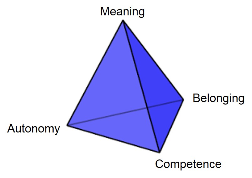 And, frankly speaking, the healthcare system universally makes all four of them worse: