
“I can’t complain, but sometimes I still do.“ Joe Walsh
It’s that time of year when under-employed, over-bored economists publish their ‘Quality of Life’ indices for the different countries of the world. As ever, they seem to be extremely good at finding things that are easy to measure and correlating them to a desired result. It’s easy, for example, to measure the GDP per capita or life expectancy of people within a country, or stick up a few thermometers and rain gauges and measure climate, or even count the number of women working as members of parliament. Not so easy then, though, to relate that to ‘quality of life’ or ‘happiness’ or ‘where to be born’. Does the knowledge that there aren’t enough female politicians in my part of the world make me depressed? Does knowing that we had no summer this year make me sad? The answer to those kinds of thorny question only emerge when we are able to escape from the highly quantifiable tangible world, and allow ourselves to enter the murky, unstructured waters of human enotion. Which is why the resulting tangible-only indices tend to be utterly meaningless. It’s one thing to know that you’re life expectancy is 95, quite another altogether if you spend all that time surrounded by people whining about the difficulty of finding a good oyster fork.
So, by way of a small experiment, we thought we’d start applying some of the PanSensic emotion lenses to the problem and see what happens. What happens when we analyse the sentiments being expressed on social media, in the popular press and in magazines in the various countries of the world.
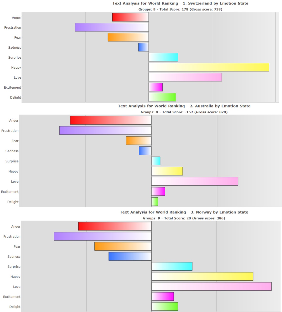
We thought we’d start with the ‘official’ Top Three places to be born, Switzerland, Australia and Norway. Here’s what we found:
We then found a way to calibrate this kind of emotion data relative to the ‘official’ tangible Where-To-Be-Born scores. What we effectively then get is a tangible-intangible graph that looks something like this:
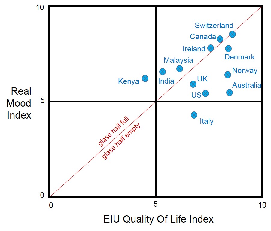
It seems to offer a quite different view of the best place in the world to be born. Perhaps the first thing to look at is the Half-Glass diagonal line. Below this line are countries where people see their glasses as half empty. Life might be tangibly great, but intangibly, people, as in the Joe Walsh song, would still prefer to focus on the negative. The further below the line a country is, the emptier the glass. Conversely, where a country finds itself above the line, it’s a sign that people are happier with their lot than their actual circumstances might otherwise suggest. These are the glass-half-full nations.
Right now the data isn’t as rich as we’d like, but already it feels like we’ve uncovered something a tad more meaningful than the economists have come up with. The nice thing is that, having connected up to a host of different live data streams, it’s very easy to add in data for other countries, and to start plotting trends over time. Enabling us to see just how transient some of the emotional scores can be. When a national cricket team loses the Ashes, for example, or loses the rugby final that can have a very definite negative effect on societal mood. Albeit a quite temporary one.
Meanwhile, sticking with our consolidated averages for 2015, it looks like Switzerland is indeed the place to be born right now. If you can’t manage that feat, though, your next best bet is Canada or Denmark. Or, if you’re happiest when you’re surrounded by other optimists, maybe India. Or how about Kenya?